This case study aims to map and document informal settlements using pix2pix model, with a focus on curating and creating an apt dataset for training and testing. The informal settlements are fluid. They consist of mainly temporary dwellings which are not meant to stay there for several generations. The speed with which they change makes the conventional mapping tools inappropriate for documenting them. Yet, there is a whole lot of reasons, mainly humanitarian, which make documenting them important. Here the ML tools may become quite handy.
The methodology which we are going to present was developed in order to facilitate and accelerate this mapping process by experimenting with various datasets. Through this we understand how the quality of images and size of the dataset matter while training the model. And also unveil the uniformity in the dataset. We have used open source tools to generate our training data and have disseminated the process of dataset generation in form of a document, for anyone to add or replicate the process.
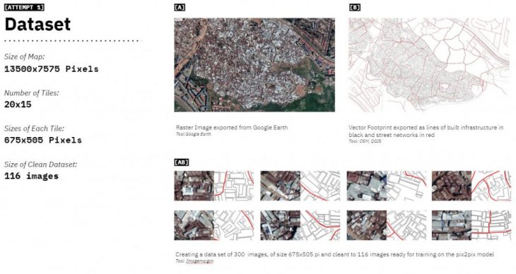
This is a test to see the potential of image data aiding to recognise, nodes, streets and built infrastructure. In this attempt the dataset is extremely small and is not of the best quality. The sole intent of the first attempt is to set a workflow for the case study. We used an export from google earth for the image map of the informal settlement and an export from Qgis, which segregated built infrastructure and streets in form of different colored lines. Splitting these base images into a grid of 20×15 we formed a dataset of 116 images post cleaning.
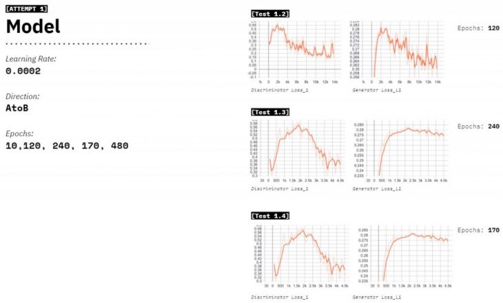
We tried 5 attempts with this dataset, where we varied the epochs from 10 to 480 and a constant learning rate, to understand the right number of epochs. We notice that in 120 Epochs the Generatorloss_L1 decreases the most. Although the visual outputs communicated the results in a better way.
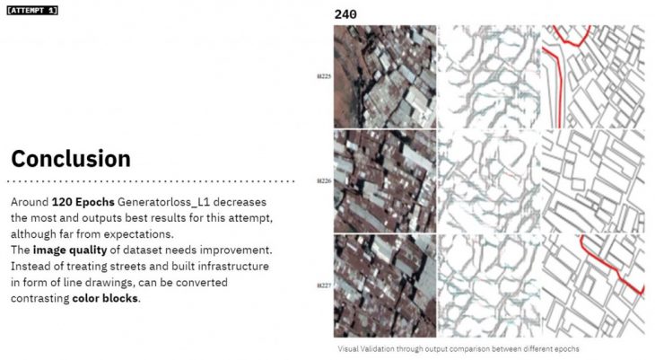
While validating and comparing the outputs visually, we realise that the results seem to be far from our expectations. We definitely needed to change the image quality for training data and accentuate on the built infrastructure through color masking.
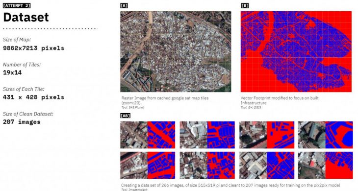
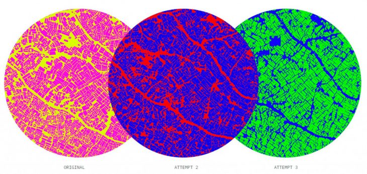
In the second Attempt color masking was used for easy recognition and distinction of pixel colors. The data set consisted of higher resolution images and cbetter cleaning. We upgraded our data quality by using multiple raster images at at 20M zoom and stitch them together to form a higher resolution map. The vector footprint was also color blocked to easily distinguish between built infrastructure and empty spaces. We end up with a data set of 207 images, which is almost double the size of our previous attempt.
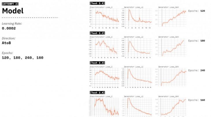
Learning from the last attempt we start training at 120 epochs, and test 4 models with a constant learning rate. We notice in-between the gradient of 120-240epochs lies the sweet spot.
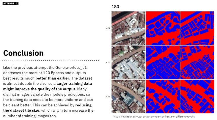
The dataset is almost double the size, so larger training data might improve the quality of the output. Although it put into foreground the variations in the dataset. Many distinct images variate the models predictions, so the training data needs to be more uniform and can be cleant better. This can be achieved by reducing the image tile size, which will in turn increase the number of training images too.
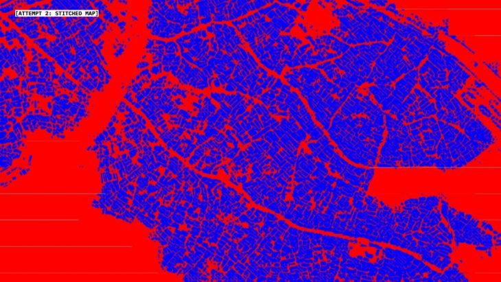
Here is a stitched and stretched version of the output data form the second attempt
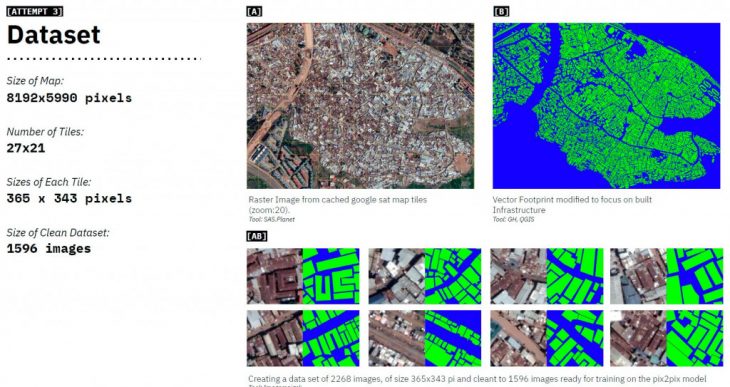
Attempt 3 was aimed at finding out how much difference does a larger dataset create? Learning from our previous attempts, we get onto cleaning the data in a way that the visual features remain uniform across the training data. By using a smaller tiles, and retaining images that are covered by at least 30% of built infrastructure; the training data is kept more uniform. The data is also rotated by 180 degrees and mirrored on vertical and horizontal axis to create a dataset 4 times larger of its base and 7.7 times than the previous attempt.
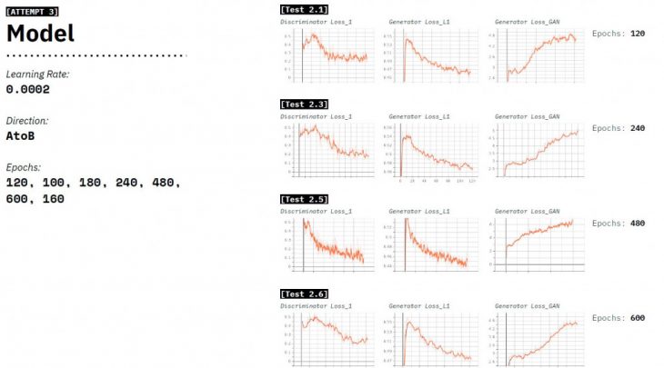
We trained 6 models, ranging from 120-600 epochs, with a constant learning rate. And understand how the number of epochs would affect the training of the model.
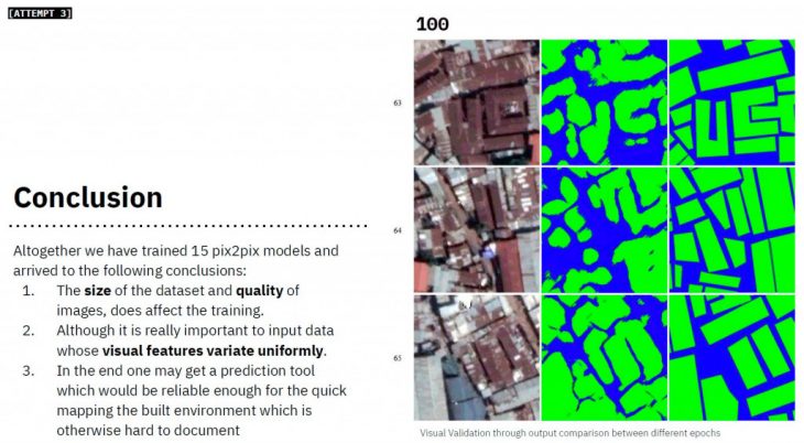
We notice an upgrade in the output geometry based on the data cleaning that kept the training relevant. The size of the dataset and quality of images, does affect the training. Although it is really important to input data whose visual features variate uniformly. In the end one may get a prediction tool which would be reliable enough for the quick mapping the built environment which is otherwise hard to document
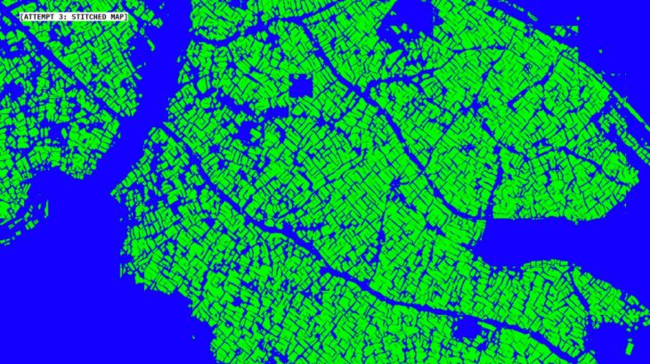
Here is a stitched and stretched version of the output data form the third attempt
Here are the compared outputs. We further translate this raster data into a vector format using a QGIS plug in Orfeo ToolBox’s segmentation algorithm to provide a shape file for the documented area. Which is not very precise but quick way of forming maps that don’t exist. As the result of this series of quick experiments we can now assert that the AI is a valid tool for solving certain urban administration problems in the situation when the conventional methods of surveying don’t really work. The population of the informal settlements requires equal provision of the social services as any other citizens. The undocumented status of both the settlements and their inhabitants makes them even more vulnerable and the call for providing them with aid – even more urgent. Knowledge about the spatial arrangement of such settlements is important for organizing the healthcare aid, emergency services and other humanitarian treatment for the people there. Here the prediction models may become an important support to the city administrations.
Senior Faculty: STANISLAS CHAILLOU; Tutor: OANA TAUT
Students: [Varun Mehta + Sergey Kryuchkov]