Tracking ourselves is an easy task today, thanks to the smartphones that are so common today. While the data which results is of a very simple nature (latitude, longitude, timestamp), there is a lot to discern about where we spend our time, how we get to places, and even perhaps, places we go that we’d rather keep secret.
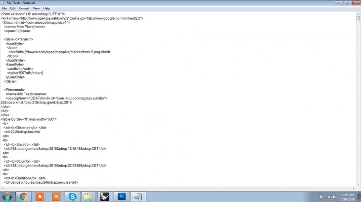
As a part of our first assignment, we were asked to track ourselves using any of the applications available on our smart phones. Few of the apps are: MyTracks, MapRunner and so on. These applications give the data in .kml or .gpx formats. Each of these formats have their own syntax to store the location (latitude and longitude) and the time.
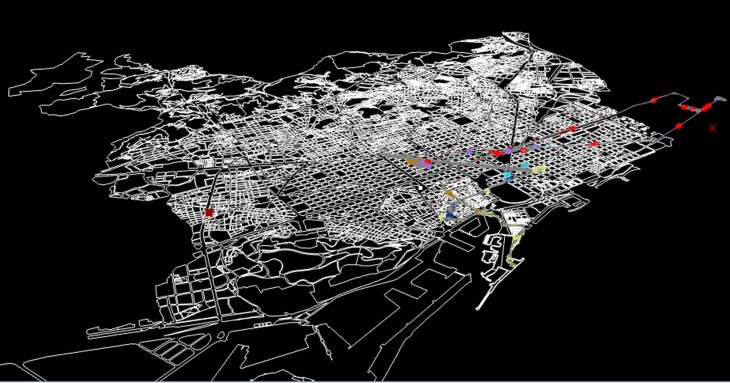
This kml file is imported to the rhino file containing the map for Barcelona. The tracks of about 10 students have been used to find where the students of IaaC are pausing or spending more time. This map would tel us if 2 or more Iaac students are meeting at a restaurant or at a stationary shop and help us locate these.
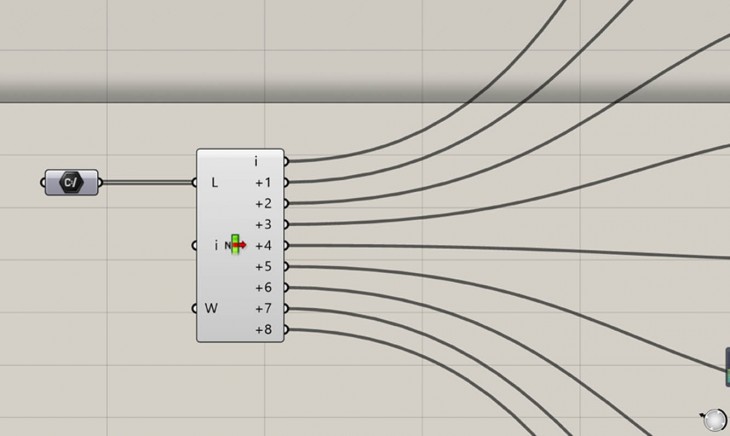
The .kml files are fed into the grasshopper using the SetFilePath. The List Item sends the input one at a time, to each of the clusters.
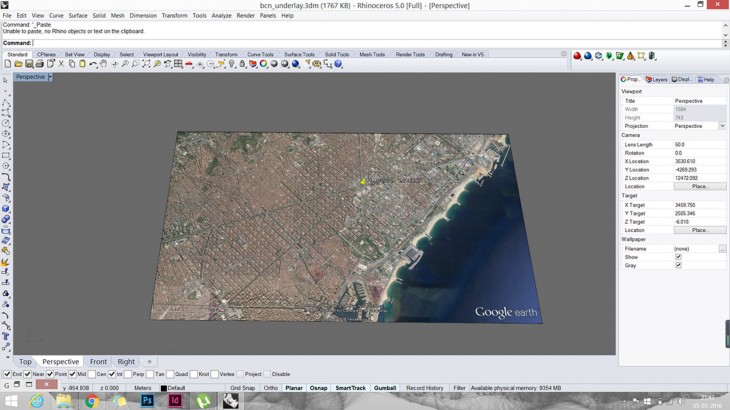
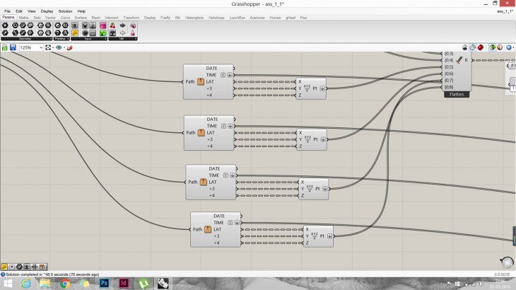
A google earth image of Barcelona is imported on to Rhino with one reference point of known latitude and longitude. This reference point is needed to locate the other points on the map with respect to this one.
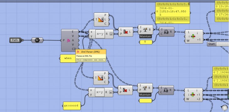
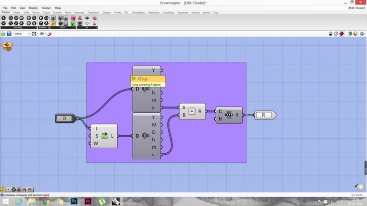
The imported kml files are then passed through the clusters where the xml parser is used and the data is filtered to obtain the time, latitude, longitudes and altitudes.
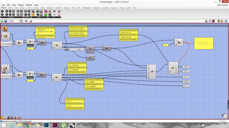
The output of these clusters are passed through several other clusters to visualise the data.
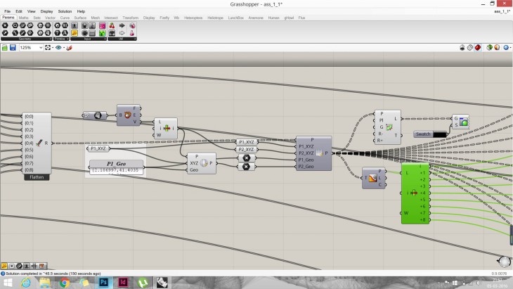
The reference point of the Barcelona map is then geo-located and the the Proximity 2D is used.
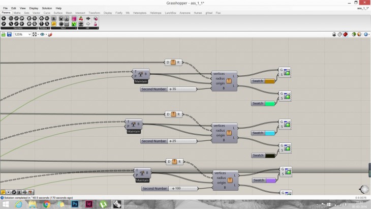
The data is then passed through 2 clusters after which, the tracking of each person is represented by 2 colours depending on the time spent in each location.
The above cluster finds out the time taken from one point to the other in seconds, The output is then taken through Range.

By passing the inputs ( origin, vertices and radius), circles are drawn based on the time spent in the locations. The time spent is then filtered based on the duration and hence, we obtain 2 outputs which gives us 2 colours.
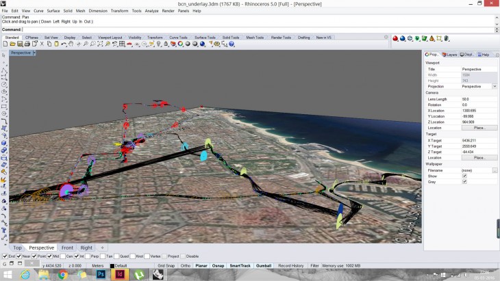
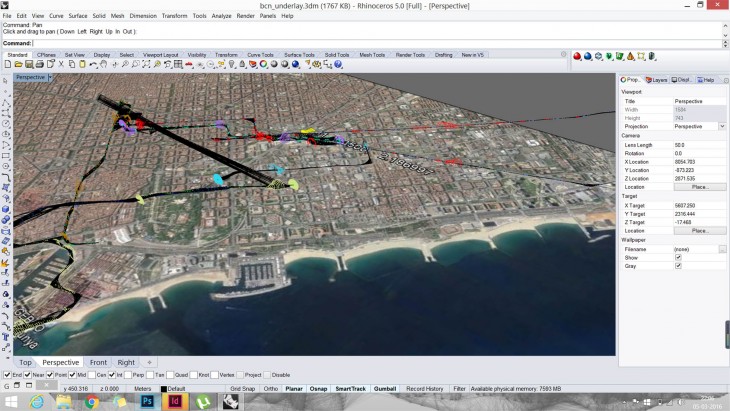
Once the data was visualised, line drawing of the Barcelona map is super imposed and the original image is hidden. This enhances the legibility of the visualisation and also, increases the precision.