
Introduction
The quest to transition from current urban metabolisms into sustainable metabolisms forces us to peer into chaotic, multi-scalar and temporally sensitive relationships. One example of these complex relationships is the relationship between a city’s Carbon Oxide (CO) emissions and its climate. Understanding this relationship may help us discover specific conditionals behind CO emission patterns. This information may also help develop optimization and transition strategies. The objective of this work is to propose a methodology to visualize possible relationships between urban CO emissions and its climate.
Framing the problem:Socially Constructed Emission Patterns
Carbon Oxide (CO) is a byproduct of the burning of carbon containing fuels (Transportation Research Board and National Research Council, 2002). The concentration of CO particulate matter may serve to co relate energy consumption patterns, particularly so if the CO levels are geolocated and measured through time. The location is relevant because consumption patterns are the product of specific socioeconomic and climatic contexts. The temporal variable allows us to co relate specific CO emissions with time-specific periods of activity (car emissions during rush hour, morning and evening surges in home activity, etc.)
While CO emissions are produced by a myriad of anthropogenic sources, of which some are independent from each other, their presence in urban space varies and, is generally the product of a specific set of uses (i.e.: motor vehicles, domestic appliances, air conditioning).
While aggregate emissions data alone cant be used to determine the source of the emission, we can co relate these patterns with the most common periods of human activity. These periods might be considered the common daily routines in a specific society. Examples of these routines bight be rush hour traffic, cooking meals, office hours, etc. By looking into how and when we produce most of our emissions, we might be able to visualize patterns and anomalies, thus being able to develop transition strategies.
While we can suppose CO emissions are co related to these daily routines, understanding how other variables (such as climate) affect these emission patterns requires adding georeferenced data. This work uses data from 9 cities, grouped into three different climate regions. Spain was chosen as the area of study because of its diverse climate and availability of data.
The Spanish Climate
This map illustrates the average annual temperatures in the Iberian Region
Spanish climate is diverse and its varying weather patterns are the product of specific conditions of each site (Instituto Geográfico Nacional, 2018). None the less, we can group these specific weather conditions into broader climate regions. These regions respond to the confluence of two extreme weather patterns: cold, humid weather flowing from the north (in cities like Burgos, Segovia and Lugo) and the hot, dry weather arriving from the south (in cities like Córdoba, Sevilla and Murcia). Caught between these two powerful climatic forces, exists a climate region that is the product of this meeting. This intermediate climate region experiences both heat in the summer and cold in the winter but escapes the extreme temperature peaks of the other regions. For the purpose of this work, this region is named the Temperate Region and the cities who might represent this region are Barcelona, Madrid and Zaragoza.
Hypothesis
1- Cities with more extreme weather peaks (extremes) will produce more CO than those in more temperate regions.
2- CO emission peaks will correlate with specific human activities.
Data Sources & Methodology
In order to establish the spatial boundary of the climate variables, three main climate regions within Spain where identified (Hot, Temperate, Cold). The boundaries of these regions respond to the averaged temperatures within their territory. Three cities from each climate region where chosen based on the availability of the OpenAQ platform and their representativity of their respective climate regions. Cities who had the most extreme averaged temperatures where chosen for the Hot and Cold regions, while the cities in the Temperate regions where selected based on their relatively stable temperature averages.
The chosen cities are organized as follows:
Hot: Córdoba, Murcia, Sevilla
Temperate: Barcelona, Madrid, Zaragoza
Cold: Burgos, Lugo, Segovia
Once selected, the datasets were cleaned and organized to ease handling and to improve legibility. Datasets of daily CO emissions where sourced from the OpenAQ platform for the year 2020. Emission values where averaged whenever two or more dates coincided. When only one value was registered, it was used without being averaged.
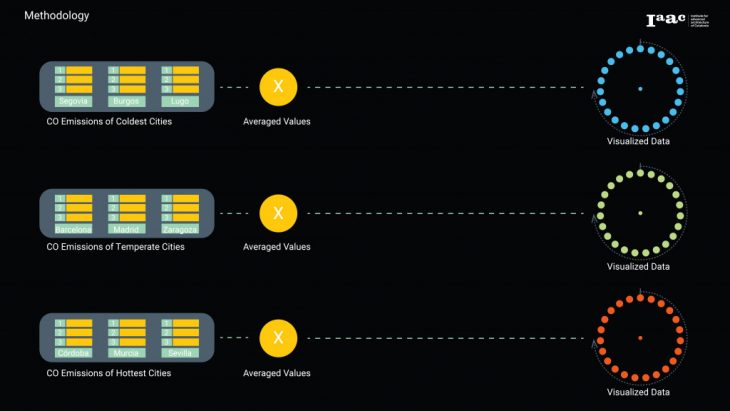
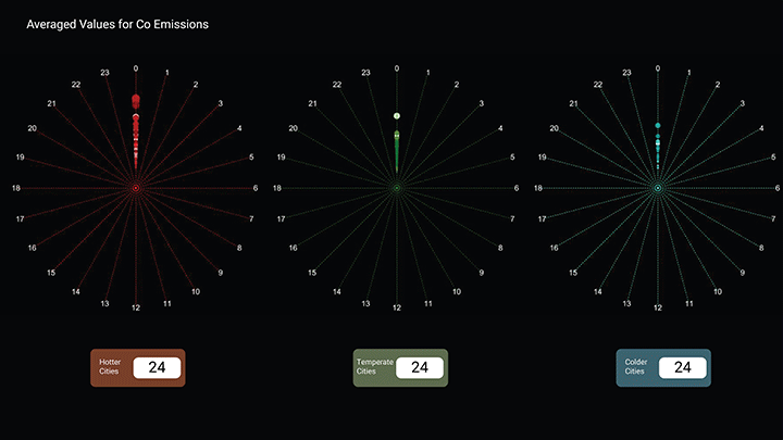
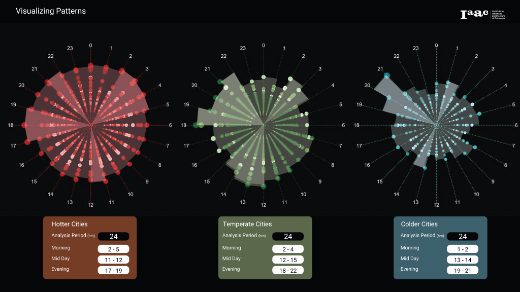
Finally, the Averaged CO emission values where visualized using a graph that would show the progression of values through a 24 hour period in order to see the variances at the hourly scale. Three graphs where visualized, one for each climate region. A Grasshopper script developed during the Computational Urban Design class was used to visualize the data.

This illustration identifies the components of the visualization tool used in this work.
Results & Analysis
The results show clear trends when framed within a 24-hour period, while also showing vast differences in emission patterns when climate regions are contrasted. Accordingly, our analysis will discuss the 24-hour cycle as one scale, and the comparison between climate regions as another. The 24-hour was divided into three sub-periods. These sub-periods are structured as Morning (1am – 11am) Mid-day (12 – 16) and Evening (17-24). The sub-periods are considered to correspond with distinct periods of human activity. We may assume a common set of activities throughout the population within each sub-period (such as getting ready for school and work in the mornings or watching TV in the evenings).
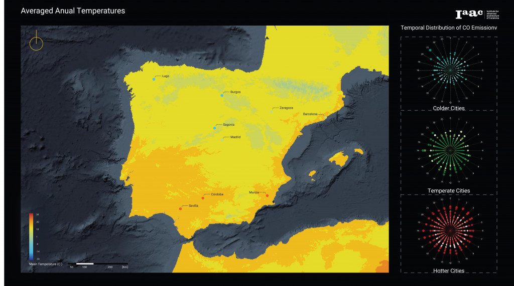
This map presents identifies the cities used in the work and the averaged CO emissions for each climate region.
Hotter Cities:
This dataset showed the highest and most constant average in CO emissions throughout the 24hour period out the three datasets. This dataset shows little difference between its average CO emissions and its “peak” emissions period. We can identify four peaks in emissions production: 2-5, 11-12, and 17-19.
Temperate Cities:
This dataset showed the most consistent progressions in CO emissions out of the three datasets. The peaks in this dataset tend to be preceded by hourly increments in emissions. This dataset also shows three emissions peaks, one per sub-period. In the mornings, peak emissions were measured between 2-4. In the Mid-Day sub-period, the peak was registered between 12-15 and between 18-22 in the Evening.

Cold Cities:
The coldest cities present the lowest average in CO emissions between the three datasets. It also presents the highest peak to average ratio in CO emissions. The peaks within the Cold Cities 24-hour period also correspond to one per sub-period. Peak emissions were measured between 1-2 for the Mornings, 12-14 for Mid-Days and 19-21 for Evenings.
Regional Contrasts:
The occurrence of emission peaks is similar in range and duration. Since CO emissions are a direct byproduct of carbon-based fuels, we can corelate these peaks with specific periods of human activity. Hence possibly confirming the second hypothesis. While people require energy throughout the day, we seem to more often coincide in the need for energy in specific moments. The peaks of CO emissions might be the product of the simultaneous use of energy by significant portions of the population.
One unexpected result of this work are the vast differences in consumption averages between datasets. While the first hypothesis stated that emission peaks would be different due to the climates influence, the differences in daily averages (although not surprising) was not considered. When the datasets are compared, one clear trend is evident: CO emissions increase in hotter climates. While the trend is consistent across datasets each one is unique. Colder Cities produce less emissions, Temperate Cities produce mid-range values, while Hotter Cities produce the highest emission values. That being said, establishing possible causality requires further research. Future work on this topic must be able to control variabilities in multiple aspects while gathering data. Examples of possible variabilities are weather anomalies during the study period, location of emission sensors, population quantity and density, consistency in emissions sensing, amongst others.
Conclusion:
The objective of this work was to generate a method to explore the relationship of one of the byproducts (CO emissions) of urban metabolisms and their climate contexts. The first takeaway of the results is the possibility to correlate specific periods of human activity with specific peaks in CO emissions. The second takeaway is the apparent correlation between average temperatures and average CO emissions. While the observed pattern does require further research to fully validate, it serves as an initial provocation.
Transitioning our current urban metabolisms to sustainable systems is a complex task. No metabolic system is the same as the next. Being able to address different needs from different locations first requires for us to visualize and comprehend the specific needs that each system requires. The development of tools that may visualize spatiotemporal big data is paramount in the effort to understand both patterns and specific needs between metabolic systems.
Citation:
PATTERN EMISSIONS: Visualizing CO emissions from different Spanish climate regions is a project of IAAC, Institute for Advanced Architecture of Catalonia developed at Master in City & Technology in 2020/21 By student:Mario J. González Nevárez: Eugenio Bettucchi & Iacopo Neri.
Sources:
Transportation Research Board and National Research Council. 2002. The Ongoing Challenge of Managing Carbon Monoxide Pollution in Fairbanks, Alaska: Interim Report. Washington, DC: The National Academies Press.
https://doi.org/10.17226/10378
.
INSTITUTO GEOGRÁFICO NACIONAL (2018): España en mapas. Una síntesis geográfica. J. Sancho Comíns (dir.). Serie Compendios del Atlas Nacional de España (ANE). Madrid, Centro Nacional de Información Geográfica, http://atlasnacional.ign.es/wane/Clima
Data:
http://www.aemet.es/es/datos_abiertos/AEMET_OpenData
https://openaq.org/#/locations?countries=ES&page=7&_k=52fn7q
https://opendata.esri.es/datasets/b003fcb30d224d1fae258aaa5241baaf
http://www.opengis.uab.es/wms/iberia/espanol/es_cartografia.htm
http://www.gisandbeers.com/descarga-de-cartografia-climatica
https://ourworldindata.org/co2/country/spain?country=~ESP
