Introduction
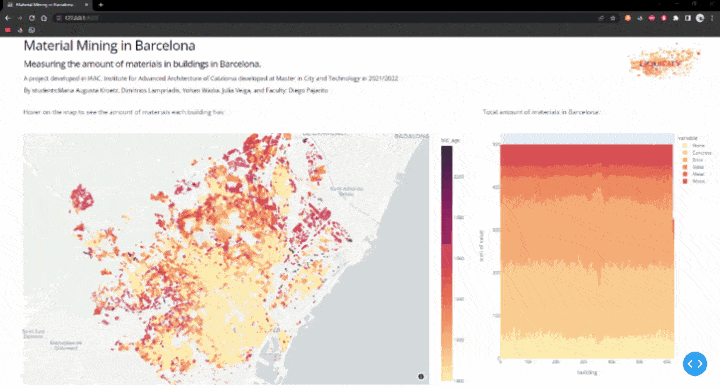
The project provides an interface to visualize how six selected materials are distributed around Barcelona buildings according to the age of construction. By analyzing and mapping these results, we can identify which materials can be mined and where. This interface is used to develop the project of “Liquicity” as a proposal for expanding the city with optimal use of resources.
Urban mining is the process of mining materials that are no longer in use, from demolished or refurbished buildings and using them for new constructions. This way the materials are up-cycled and there is less necessity of using new materials and consuming more resources.
Digital Tools and Methods
In order to quantify and identify the existing materials, it was used a machine learning process. By using Google Street View images, the software was trained to recognize six different materials in the façade of buildings. The materials are stone, concrete, brick, glass, metal, and wood.
Apart from quantifying the different materials, building age is also an important factor that was considered to produce the maps. As urban mining is the process of collecting materials that are no longer in use, we considered it important to identify building age as an indicator of buildings that could be mined. On the other hand, by knowing the building age we can predict that a certain construction method was used. For example, a building from before 1900 is most likely to have a wood structure.
First, we import/install the necessary libraries:
Expand for the Code:
# Libraries
import plotly.graph_objects as go
from dash import Dash, dcc, html, Input, Output
import plotly.express as px
import pandas as pd
Step 1: Creating and filtering the data
The used dataset (CSV file) was filtered and sorted using Pandas library in Python. That allowed a deeper analysis of the amount of each material on each building in the city. In order to visualize the necessary correlation of building ages with the materials, an extra condition had to be implemented in the process.
Expand for the Code:
# read data
df = pd.read_csv('data/alldata_wgs846.csv')
Step 2: Setting up the visualization of the map
Expand for the Code:
# setting up the app
app = Dash(__name__)
app.title = "Material Mining in Barcelona"

# setting up our figures
colors = {
    'background': '#FFFFFF',
    'text': '#000000'
}
figure = px.scatter_mapbox(df, lat="y1", lon="x1", hover_name="ogc_fid", hover_data=["ogc_fid"],
                           zoom=12, height=780,  opacity=0.5, color=df["bld_age"],
                           color_continuous_scale=px.colors.sequential.matter,
                           title="Hover on the map to see the amount of materials each building has:",
                           )
figure.update_layout(mapbox_style="carto-positron")
figure.update_layout(margin={"r": 60, "t": 100, "l": 60, "b": 10})
Step 3: Setting up the layout of the dashboard
Expand for the Code:
# setting up the layout
app.layout = html.Div(
    style={'backgroundColor': colors['background']}, children=[
        html.A(
                    html.Img(id="logo", src=app.get_asset_url("logo.png")),
                    href="https://plotly.com/dash/",
                ),
        html.H1(children="Material Mining in Barcelona", style={
            'textAlign': 'left',
            'color': colors['text']}),
        html.H3(children='Measuring the amount of materials in buildings in Barcelona.', style={
                            'textAlign': 'left',
                            'color': colors['text']}
                ),
        html.H6(children="A project developed in IAAC, Institute for Advanced Architecture of Catalonia developed at \
                         Master in City and Technology in 2021/2022"
                ),
        html.H6(children="By students:Maria Augusta Kroetz, Dimitrios Lampriadis, Yohan Wadia, Julia Veiga, and \
                         Faculty: Diego Pajarito"
                ),
        html.Div(
            className="map",
            children=[
                html.Div(
                    className="eight columns",
                    children=[
                        html.Div(
                            children=dcc.Graph(
                                figure=figure,
                                id='map',
                                # hoverData={'points': [{'customdata': 3}]}
                                # hoverData={'points': [{'hovertext': 6980}]},
                                hoverData=None
                            )
                        )
                    ]
                )
            ]
        ),
        html.Div(
            className="histogram",
            children=[
                html.Div(
                    className="four and half columns",
                    children=[
                        html.Div(
                            children=dcc.Graph(id='histogram')
                        )

                    ]

                )
            ]
        )
    ]
)
Final step: setting up the callbacks
In the final step, the interaction of the dashboard is settled. In order for the user to be able to see the total amount of materials in Barcelona when they first enter the site, an if statement was needed. This allows an overview of all the materials in the graph and a visualization of the map of the ages of buildings in the entire city. By hovering on the map the user is able to read and identify the percentage of materials in each building as well as other important information that can add on that.
Expand for the Code:
#setting up the callbacks
@app.callback(
    Output('histogram', 'figure'),
    Input('map', 'hoverData'))
def histogram(hoverData):
    print("---------------------------")
    # print(hoverData['points'][0])
    if hoverData==None:
        dff = df[df["ogc_fid"] == None]
        histogram = px.histogram(df, x='ogc_fid',
                                 y=["Stone", "Concrete", "Brick", "Glass", "Metal", "Wood"],
                                 labels={'ogc_fid': 'building'}, title="Total amount of materials in Barcelona: ", height=780,
                                 width=660,
                                 color_discrete_sequence=px.colors.sequential.matter
                                 )
    else:
        id = hoverData['points'][0]['hovertext']
        # print(id)
        dff = df[df["ogc_fid"] == id]
        print(dff)
        histogram = px.histogram(dff, x='ogc_fid',
                             y=["Stone", "Concrete", "Brick", "Glass", "Metal", "Wood"],
                             labels={'ogc_fid': 'building'}, title="Amount of materials in building ID: {0} ".format(
                                        id
                                    ), height=780, width=660,
                             color_discrete_sequence=px.colors.sequential.matter
                             )
    return histogram
if __name__ == '__main__':
    app.run_server(debug=True)
Conclusion
The functionality of the dashboard is that users can understand and identify the capacity of cities as repositories of local construction materials in order to make upcycling of used materials a reality.
In the future, by adding more information to the interface, it will be possible to correlate more data and add more information and get a further understanding of upcycling. It can also provide users the capacity to expand the identification of not only materials but also other parts of the built environment.
Data sources: Open BCN, OpenStreetMaps, Google street view
‘Material mining in Barcelona’ is a project of IAAC, Institute for Advanced Architecture of Catalonia developed in the Master in City & Technology 2021/22 by Students: Dimitrios Lampriadis, Julia Maria Ferreira Veiga, Maria Augusta Kroetz and Yohan Wadia Faculty: Diego Pajarito and Tugdual Sarazin