OhNo Type Eckmanpsyche Voronoi
lat2dev is an experimental research,
testing how Artificial Intelligence can aid the creation of Multi script fonts.
The research uses parametric workflows for data generation and pix2pix GANs for training and testing.
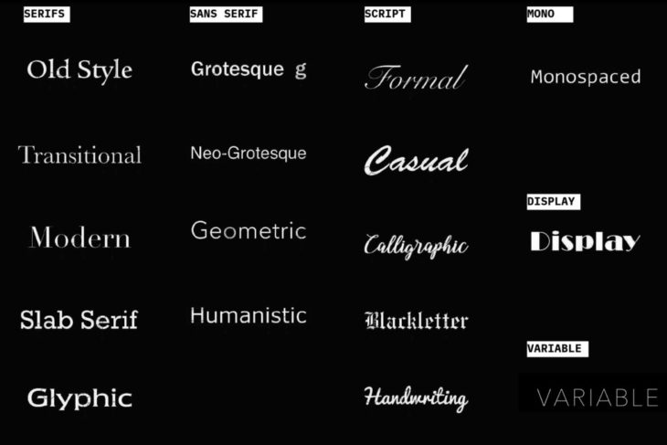
Introduction to Typography
Typography has grown quite a bit, from handwritten to the printing press and now digital type.
You might have heard of the words, serifs, sans serifs, mono, display and variable
These are mostly classified on the basis of their geometrical appearance
And also use case,
For example the mono-space type is the one we use while coding,
Here all the letters are the same width so as to locate errors easily.
But if you notice all of these are classified for the latin script,
Mainly because English as a language is widely used.
Latin Typeface Classification
Types of Fonts// Latin Script
Latin script is the basis for the largest number of alphabets of any writing system and is the most widely adopted writing system in the world commonly used by about 70 percent of the world’s population.
+Specifications:
5 Vowels
21 Consonants
Uppercase and Lowercase
+Languages:
English, French, Spanish, Italian, Dutch, Norwegian, German, Portuguese, Czech, Slovak, Hungarian, Polish, Danish, Welsh, Swedish, Icelandic, Finnish, and Turkish
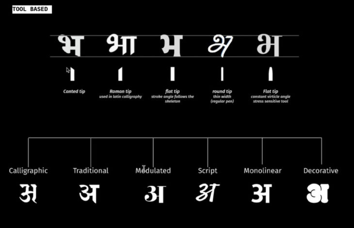
Devanagari Classification by Athang Samant for type weekend
Types of Fonts// latinScript
Devanagari evolved from Brahmi Script, a development of system of phonetics. It is the only script which has specific signs (grapheme), for the phonetically arranged sounds of human speech (phonemes).
Unfortunately the form of this script has not been explored digitally as much as the latin script has. And it still finds its origins through the traditional calligraphic tips
+Specifications:
13 Vowels Each vowel has two forms:The dependant form (matra) and the independent form
36 Consonants
NO Uppercase and Lowercase
+Languages:
Over 120 Languages
Hindi, Sanskrit, Pali, Marathi, Angika, Maithli, Nepali, Magadhi, Bhojpuri, Awadhi, Bundeli, Brajabhasha, Pahadi, Mundari, Bhili, Bodo, Chhattisgarhi, Dogari, Garhwali, Hariyanvi, Kashmiri, Konkani, Nepalbhasha, Rajshtani, Santhali, Sindh….
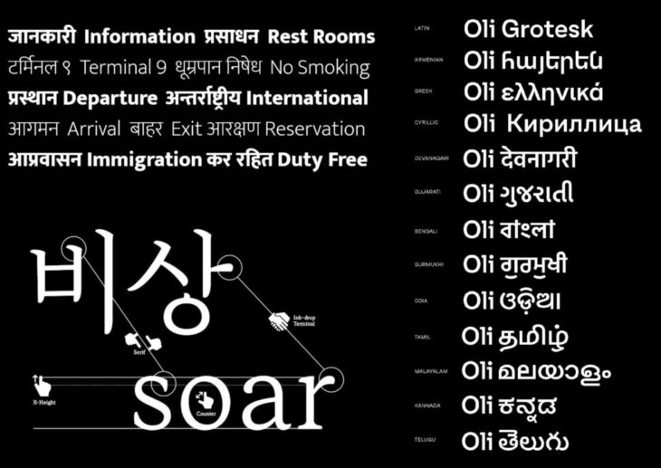
Multi script Fonts (Mukta by Ektype & Oli by typotheque)
Types of Fonts// Multi Script Fonts
Multi-script typography refers to typefaces which include more than one writing system in their character set.
And shares the same geometrical and visual attributes, to construct the glyph set.
They are a great tool for multilingual design and cultural exchange.
The design of a multi-script typeface is a tough task that requires ample knowledge in typography, metrics, orthography and also in the cultural conventions belonging to each script. It is considerably more difficult than the design of a mono-script typeface
+Physical Use Cases:
Signage
Way-finding
Print Media
+Digital Use Cases:
Web
Assisted Reality
Translation
Research Statement
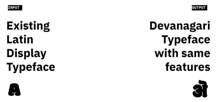
What if we could convert existing Latin fonts into multi-script typefaces?
Problem Statement
Even though lots of designers work towards creating multi script typefaces,
Devanagari Lacks Variety.
Mainly because creating multi script fonts is an extremely time consuming process.
Aim:
This study attempts to map out the correlations between the anatomy of Latin and Devanagari scripts.
For easy conversions of Latin Typefaces to its Devanagari Counterparts; assisting the creation of multi script fonts.
We document these attempts in form of Parametric and Machine Learning workflows.
Prelude // dev.SYS
The aim was to create a minimal multi script font, in order to relate the anatomy of both Devanagari and Latin Scripts based on form observations, organization and segregation.
Construction
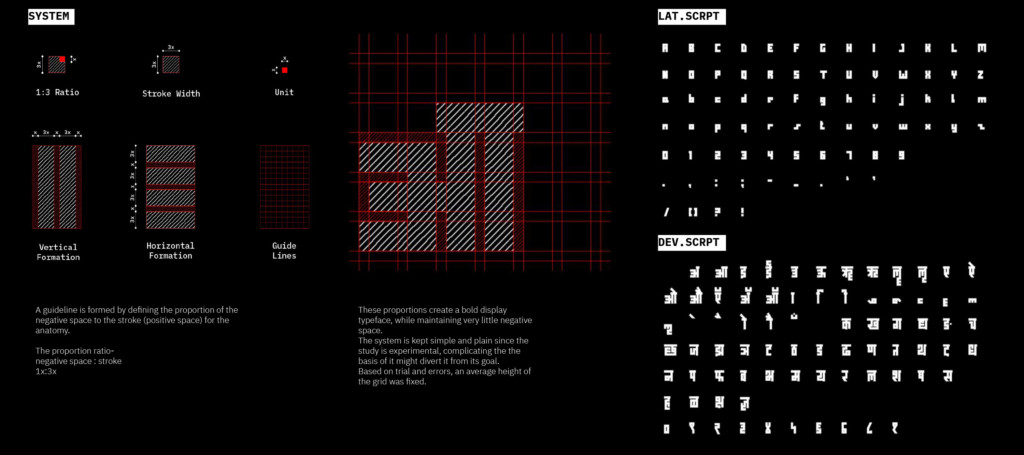
dev.SYS / System
A guideline is formed by defining the proportion of the negative space to the stroke (positive space) for the anatomy.
The proportion ratio-
negative space : stroke
1x:3x
These proportions create a bold display typeface, while maintaining very little negative space.
The system is kept simple and plain since the study is experimental, complicating the the basis of it might divert it from its goal.
Based on trial and errors, an average height of the grid was fixed.
Organization
dev.SYS / Organization
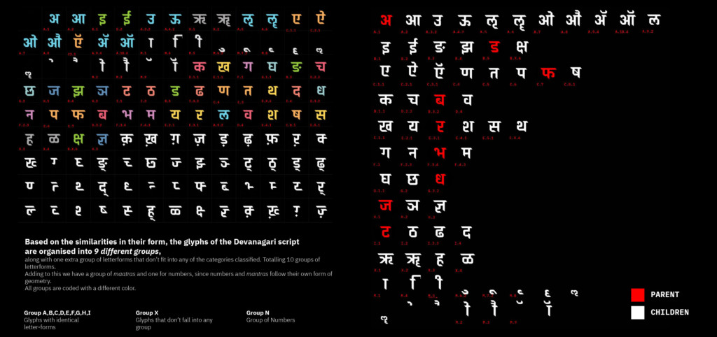
Based on the similarities in their form, the glyph of the Devanagari script are organized into 9 different groups,
along with one extra group of letter forms that don’t fit into any of the categories classified. Totaling 10 groups of letter forms.
Adding to this we have a group of maatras and one for numbers, since numbers and mantras follow their own form of geometry.
All groups are coded with a different color.
Then we identify a parent for each group (marked in red)
From which all the other group member can derive their form.
Correlation
dev.SYS / Co relation
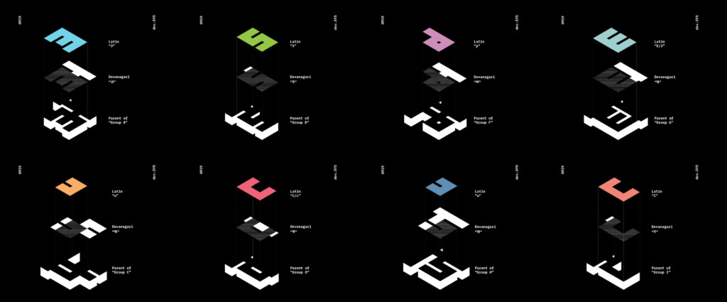
We correlate every Devanagari parent to Latin anatomy.
To read more: www.mehtavarun.com/devsys
Takeaways
dev.SYS / Feedback
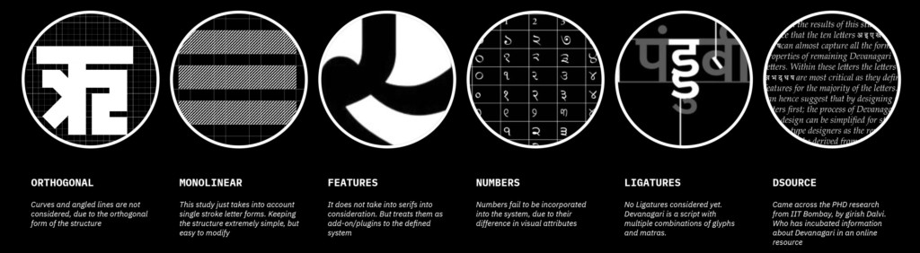
+Orthogonal
Curves and angled lines are not considered, due to the orthogonal form of the structure
+Monolinear
This study just takes into account single stroke letter forms. Keeping the structure extremely simple, but easy to modify
+Features
It does not take into serifs into consideration. But treats them as add-on/plugins to the defined system
+Numbers
Numbers fail to be incorporated into the system, due to their difference in visual attributes
+Ligatures
No Ligatures considered yet. Devanagari is a script with multiple combinations of glyphs and matras.
+Dsource
Came across the PHD research from IIT Bombay, by Girish Dalvi. Who has incubated information about Devanagari in an online resource
Methodology
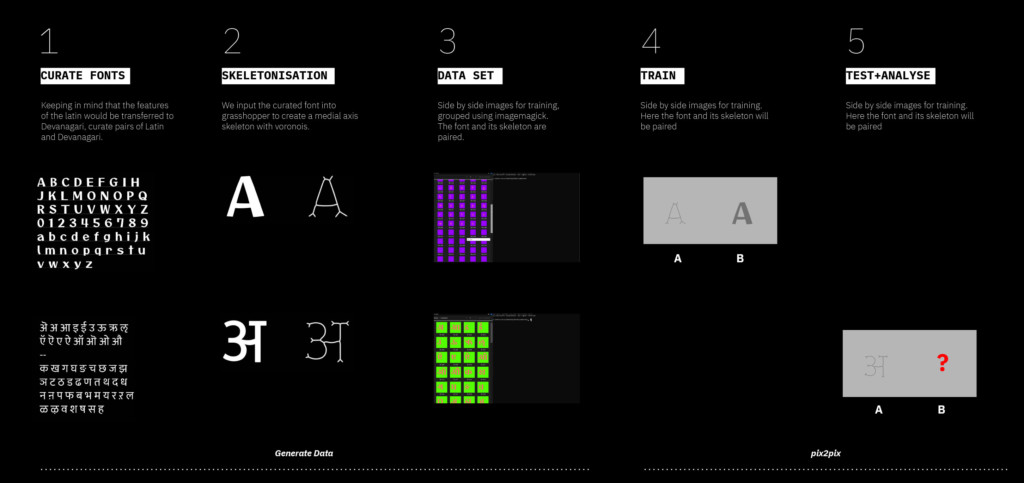
The process is divided into 5 stages.
Stages 1-3 are responsible for data generation, and 4-5 is for training and testing an ML model.
(1) Keeping in mind that the features of the Latin would be transferred to Devanagari, curate pairs of Latin and Devanagari.
(2) We input the curated font into grasshopper to create a medial axis skeleton with voronois.
(3) Side by side images for training, grouped using imagemagick.
The font and its skeleton are paired.
(4) Train a pix2pix model on the Latin skeletons, to create Latin forms
(5) Test the same model on Devanagari skeleton.
Data Generation
Curated fonts

Four font pairs curated for training and testing data.
(1) To mimic: Filleted Conjunction and rounded terminals Variation in stroke/brush thickness
Latin
Typeface: Otomanopee
Foundry: Gutenberg Labo
Devanagari
Typeface: Mukta Regular
Foundry: ektype
(2) To mimic: Filleted Conjunction and rounded terminals
Latin
Typeface: Maxi Round Light
Foundry: ABCDinamo
Devanagari
Typeface: Popins Regular
Foundry: ITF
(3) To mimic: Evident slab serif with thick vertical stems and arms.
Latin
Typeface: Beastly 12
Foundry: OHNO
Devanagari
Typeface: Baloo Extrabold
Foundry: ektype
(4) To mimic: The Variating Organic Form
Latin
Typeface: Eckmannpsyche
Foundry: OHNO
Devanagari
Typeface: Rozha One
Foundry: ITF
Skeletenisation
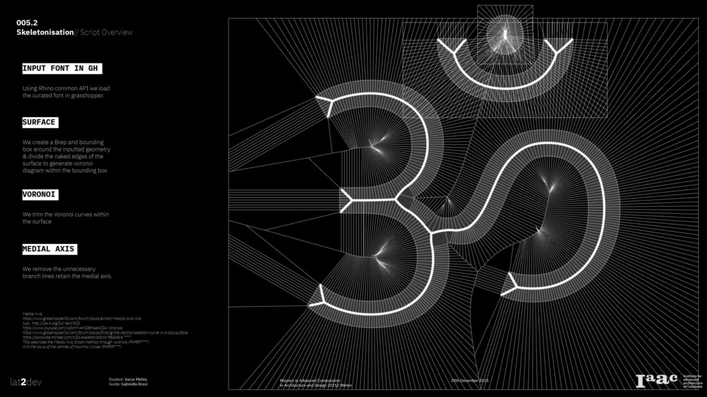
Using Rhino common API we load the curated font in grasshopper.
We create a Brep and bounding box around the inputted geometry & divide the naked edges of the surface to generate voronoi diagram within the bounding box.
We trim the Voronoi curves within the surface
We remove the unnecessary branch lines retain the medial axis.
Tests
Test 1 // Mukta Validation
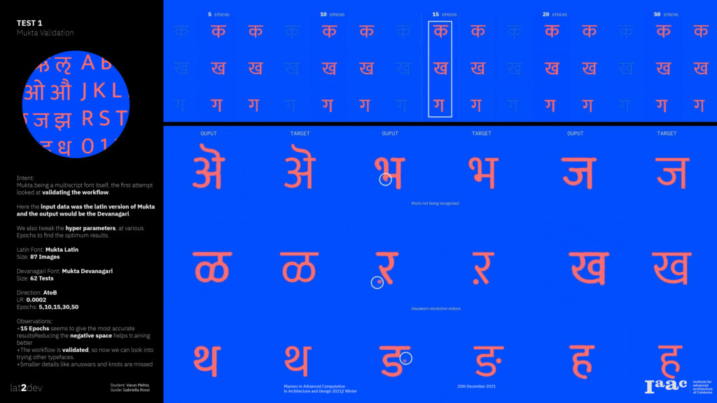
Intent:
Mukta being a multiscript font itself, the first attempt looked at validating the workflow.
Here the input data was the latin version of Mukta and the output would be the Devanagari.
We also tweak the hyper parameters, at various Epochs to find the optimum results.
Observations:
+15 Epochs seems to give the most accurate resultsReducing the negative space helps tr.aining better
+The workflow is validated, so now we can look into trying other typefaces.
+Smaller details like anuswars and knots are missed
Test 2 // Maxi
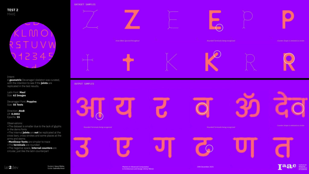
Intent:
A geometric Devanagari skeleton was curated, with the intention to see if the joints are replicated in the test results.
Observations:
+The dataset is smaller due to the lack of glyphs in the demo fonts
+The internal joints are not be replicated at the cross bars, cross strokes and some places at the arms and stems
+Monlinear fonts are simpler to trace
+The terminals are rounded
+The negative space, internal counters are circular, just like the latin counterpart
Test 3 // Beastly
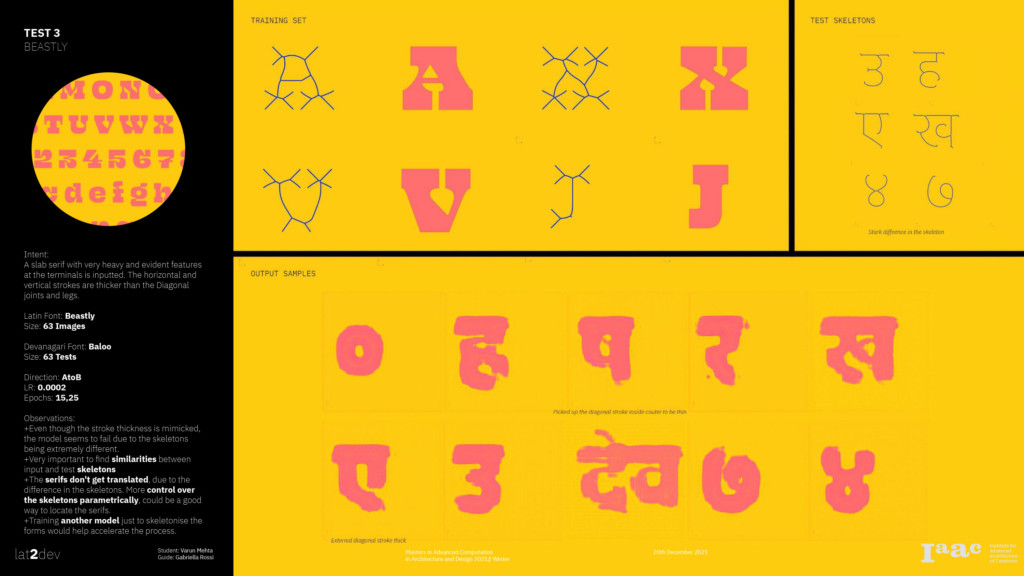
Intent:
A slab serif with very heavy and evident features at the terminals is inputted. The horizontal and vertical strokes are thicker than the Diagonal joints and legs.
Observations:
+Even though the stroke thickness is mimicked, the model seems to fail due to the skeletons being extremely different.
+Very important to find similarities between input and test skeletons
+The serifs don’t get translated, due to the difference in the skeletons. More control over the skeletons parametrically, could be a good way to locate the serifs.
+Training another model just to skeletonise the forms would help accelerate the process.
Test 4 // Eckmannpsych
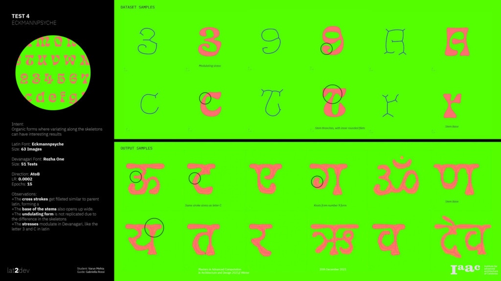
Intent:
Organic forms where variating along the skeletons can have interesting results
Observations:
+The cross strokes get filleted similar to parent latin, forming a
+The base of the stems also opens up wide.
+The undulating form is not replicated due to the difference in the skeletons
+The stresses modulate in Devanagari, like the letter 3 and C in latin
Conclusion
++
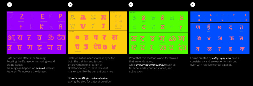
Data set size affects the training.
Rotating the Dataset or mirroring would create issues.
Training can happen on isolated relevant features. To increase the dataset.
++
Skeletonization needs to be in sync for both the training and testing. Improvement on creation of skeletonisation, to leave relevant markers, unlike the current branches.
Or train an ML for skeletonisation,
saving the step for dataset creation.
++
Proof that this method works for strokes that are undulating,
while preserving detail features such as terminal ends, counter shapes, and spline axes
++
Forms created by calligraphy nibs have a consistency and are easier to train on, even with relatively small dataset.
Futures
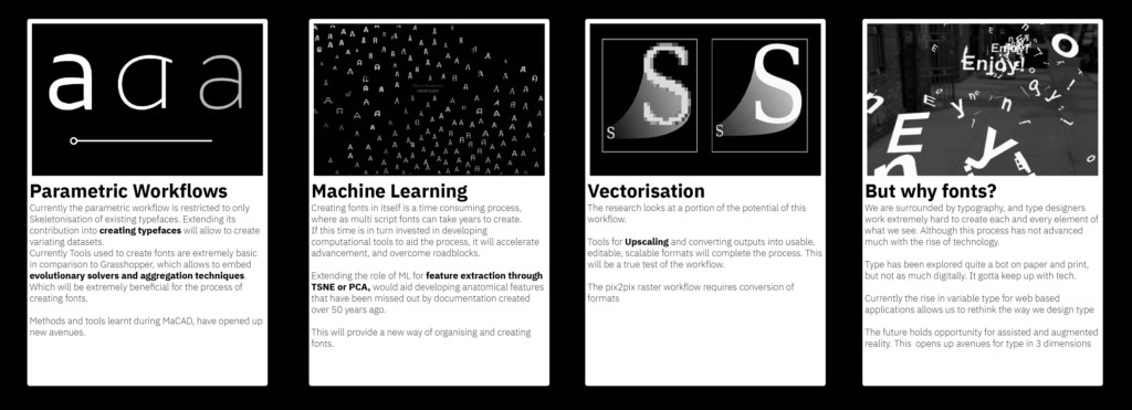
Parametric Workflows//
Currently the parametric workflow is restricted to only Skeletonisation of existing typefaces. Extending its contribution into creating typefaces will allow to create variating datasets. Currently Tools used to create fonts are extremely basic in comparison to Grasshopper, which allows to embed evolutionary solvers and aggregation techniques. Which will be extremely beneficial for the process of creating fonts.
Machine Learning//
Creating fonts in itself is a time consuming process, where as multi script fonts can take years to create.
If this time is in turn invested in developing computational tools to aid the process, it will accelerate advancement, and overcome roadblocks.
Extending the role of ML for feature extraction through TSNE or PCA, would aid developing anatomical features that have been missed out by documentation created over 50 years ago. This will provide a new way of organising and creating fonts.
Vectorisation//
The research looks at a portion of the potential of this workflow.
Tools for Upscaling and converting outputs into usable, editable, scalable formats will complete the process. This will be a true test of the workflow.
The pix2pix raster workflow requires conversion of formats
But why fonts?
We are surrounded by typography, and type designers work extremely hard to create each and every element of what we see. Although this process has not advanced much with the rise of technology.
Type has been explored quite a bot on paper and print, but not as much digitally. It gotta keep up with tech.
Currently the rise in variable type for web based applications allows us to rethink the way we design type
The future holds opportunity for assisted and augmented reality. This opens up avenues for type in 3 dimensions
Acknowledgements
A super thank you to Gabriella Rossi, David, Oana, Stan for all the support, motivation and guidance.
Girish Dalvi, Athang Samant, Mumbai Typostamitch, for sharing resources on Devanagari.
Ektype, OHNO, ABCDinamo and Indian type foundry for sharing demo versions of the test fonts
Hesham, Joao for always having my back.
Project Credits
lat2dev is a project of IAAC, Institute for Advanced Architecture of Catalonia developed in the Master in Advanced Computation for Architecture & Design in 2021/22 by
Students: Varun Mehta
Faculty: Gabriella Rossi