Understanding urban mining material extraction data
Introduction
The aim of the exercise is to design a dashboard to support a part of the urban mining project developed in the Internet of Buildings design studio. The project offers a platform for the use of constructing cohousing projects around the city of Barcelona and bringing all the stakeholders to a single platform. The platform’s main objective is to create a circular strategy for the construction and demolition process. The platform would incorporate the “dashboard” for this purpose where users can access information regarding available buildings for demolition, their location, age, height, perimeter, the percentage of material composition they consist of and their current uses.
Digital Tools and Methods
The initial datasets (csv, shp files) were filtered and sorted using Python which resulted in the generation of various maps explaining the percentage of density of each material in the entire city. For further visualization and to add relevant layers of data, QGIS was used. Visualizations of the data had been obtained in different formats for the convenience of analysis.
As the project’s research focuses on the role of urban mined materials in the construction of cohousing projects, the district Sant Marti is used as a case study to test how the dashboard would perform. The map below shows only the buildings that are available for either demolition or renovation in the district, hence these would act as the extraction sites for materials. Their current use has been assigned as well so that when the dashboard user is accessing this information, they can also estimate the condition and availability.
Sant Marti : Extraction (demolition + renovation) Sites by Current Land Use

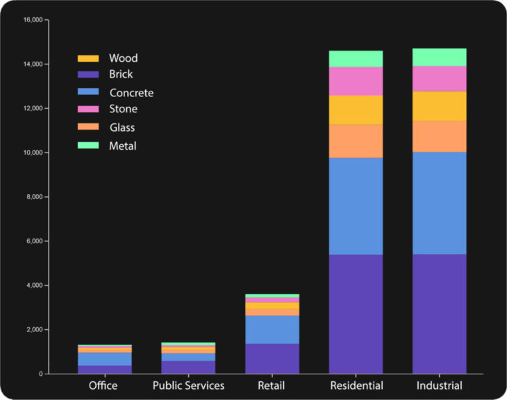
Stacked Bar Graph : Availability of Material by Current Land Use
With the information of the selected extraction sites, the stacked bar graph below shows the relationship between percentage of material and the use of the building. The x-axis represents the current land use and the y-axis represents the percentage of density of materials. The bar graph illustrates that the percentage in material composition used by residential and industrial buildings are very similar.
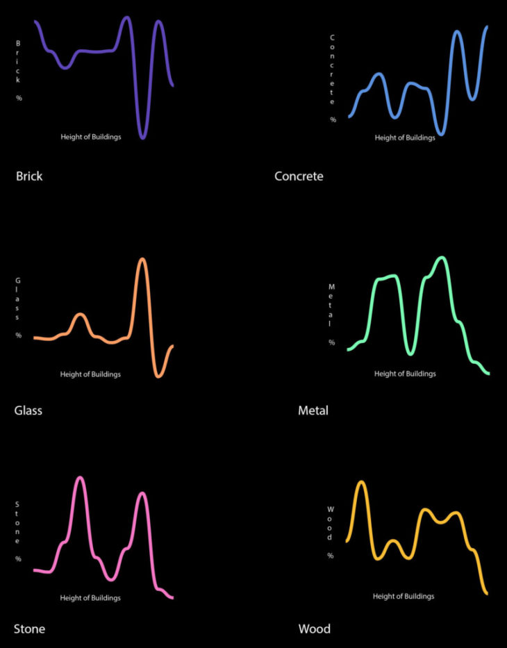
Simple Line Plots : Availability of material by height of the building
Another visualization is generated for understanding the relationship between the percentage of density of materials and the height of the structure. This is achieved by creating Line Plots, where each data point is represented as a vertex of a curve in the two-dimensional space. The line in the graph shows the average availability of the selected material. These plots are generated for each material: brick, concrete, glass, metal, stone and wood.
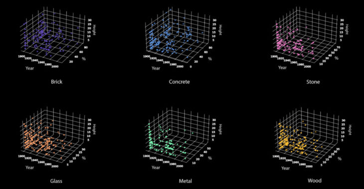
3D Scatter plot : Availability of material by building age and height of the building
Libraries Installed:
from mpl_toolkits.mplot3d import Axes3D
import matplotlib.pyplot as plt
import pandas
The scatter plot below added another parameter to the previous step – the building age. Again the data was visualized for each selected material separately. As this data required a z-axis to be represented in, a 3D Scatter Plot is used to display the properties of data as three variables using the Cartesian coordinates. In matplotlib to create a 3D scatter plot, mplot3d toolkit (Axes3D) had to be imported along with matplotlib and pandas. Once the libraries are imported the points have to be defined. From the matplotlib library, the function scatter3D accepts the points for X, Y and Z (x, y are array points and z are floating points) to build the plot. Once visualized, the plot illustrates the reading of the data. Cross referencing these three information (building age, height, percentage of material) would help the user understand the quality, strength and durability of the specific material. On a holistic level, the user can then conclude which material and from which building they intend to mine from.
Animated figures with Sliders in Dash
Libraries installed :
import dash_bootstrap_components.themes
from dash import Dash, dcc, html, Input, Output
import plotly.express as px
Animated Figures : Scatter Plot and Bar Graph
A bubble chart animation is generated to compare the relationship with a number of parameters (material, building age, height, current use). The user can select to play the animation for either “material” or “height”. For ‘material”, a scatter plot is animated and for “height” it is a bar chart. The bubble chart animation shows the use of “Percentage of Brick” against the use of “Percentage of Glass” of the selected buildings for extraction according to the building age (ranging from the=year 1900 to 2006), coloured according to their respective land use and sized by the height of the building. The animations are designed to work in an uninterrupted manner when each row of input is present across all animation frames, and when categorical values respond to the mapped symbol, color and facet constantly across all frames. The loading page is defined as a ‘cube’. The function “update” is then used to visualise the animation better.![]()
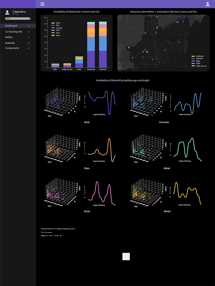
Dashboard : For the user group Cooperatives
Dash works with a provided data frame, in this case a csv file is used. Dash components are described by a set of attributes. The purpose of using the Dash is to make the application interactive. Callbacks are used to determine which parts of the app are interactive and what they would react to, thus enabling users to filter the data according to their preferences. “Slider” is the input component that has multiple configurations. The slider in this exercise is set by a column, “building age” from the data frame. The selected value on the slider (for example, the year 1973) would command the callback output to display the comparison of material composition and height for the available buildings corresponding to that year. Following is the complete dashboard that a user would access.
Conclusion
Dashboard’s most unique attribute is the interactive feature in addition to the rest of the data visualization. The one created in this exercise is used to display all of the information that has been analyzed in the previous steps (map, bar chart, graphs and animation) for the whole exercise together. This flexibility allows the user to read the data easily regarding the availability of materials and compare them amongst themselves to arrive at an informed decision of choosing which material to mine and from where.
References
Github
plotly
Matplotlib
Dash
Data Source
Open data BCN
Carto BCN
‘Get your ingredients’ is a project of IAAC, Institute for Advanced Architecture of Catalonia developed in the Master in City & Technology 2021/22 by Students: Gayatri Agrawal, Kriti Bhavesh Nirmal and Aida Hassan Faculty: Diego Pajarito and Tugdual Sarazin