Introduction
The aim of this project is to map and interpret ethnicity in Greater London. Using the London DataStore¹ as the main source of information it was possible to spatialize and compare ethnicity rates in the capital of the UK by using Python scripts for interpretation and visualisation of the outputs. Each of the described steps of the process will be related to the lines of code of the Python script used to produce this research.

Coding process description
Datasets descriptions and links
For this research, two main datasets were used: the spatial data of the wards of Greater London and the numeric data of ethnicity per ward. The first dataset was a georeferenced file (.geojson) structured by linking the spatial data with a unique code for each ward of the city. This ward code would be, further on, the key link between the two datasets. The ethnicity dataset, on the other hand, was a table with text and numeric data (.csv) without any spatial reference. This dataset was structured with the values of inhabitants of each ethnicity per ward in Greater London.
In order to join these two pieces of information, the starting point of the code was reading and linking these two different kinds of data. In order to do that, the pandas library was used to read the numeric data whereas the geopandas library was used to interpret the geospatial data.
Code:
# Libraries
import geopandas
import pandas as pd
import numpy as np
import matplotlib.pyplot as plt
from mpl_toolkits.axes_grid1 import make_axes_locatable
# read geospatial data
london_ward_geojson = ‘../data/london/london_ward_Oldcode.geojson’
ward = geopandas.read_file(london_ward_geojson)
# read CSV data for ethnicity
ethnic_group = ‘../Assignment/ethnic-group-ward-2001_Edited.csv’
ethnicity = pd.read_csv(ethnic_group)
With these two datasets correctly interpreted inside the same environment, the next step was to join them by a common index: the ward code. The merge operation was based on the spatial data as the main list of values and the numeric data of inhabitants per ethnicity per ward was related each time there was a coincident value in the ward code column.
Code:
# Merging the two dataframes, starting from the geodataframe
ethnicity_geo = ward.merge(ethnicity, right_on=‘Ward Code’, left_on=‘CODE’, how=‘right’)
#Collecting the columns in a list
ets =
[‘White’, ‘Mixed’, ‘Asian’, ‘Black’, ‘Chinese/Other’ ,’White British’ ,’White Irish’ ,’White Other White’,
‘Mixed White and Black Caribbean’,’Mixed White and Black African’,’Mixed White and Asian’,’Mixed Other Mixed’,
‘Asian or Asian British Indian’,’Asian or Asian British Pakistani’,’Asian or Asian British Bangladeshi’,
‘Asian or Asian British Other Asian’,’Black or Black British Black Caribbean’,’Black or Black British Black African’,
‘Black or Black British Other Black’,’Chinese or other ethnic group Chinese’,
‘Chinese or other ethnic group Other Ethnic Group’]
1st approach
Having the two datasets joined into a single dataframe, our first approach consisted in batch plotting maps depending on the values for inhabitants per ethnicity per ward. This analysis led us to a collection of maps comparing the values of a certain ethnicity between the wards of Greater London, as shown in the image below:
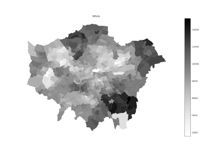
Collection of ethnicity maps per ward of London.
Code:
# Step 1 – to create the different ethnic group based on Wards individually for each ethnicity
for col in ets:
ethnicity_geo.plot(column=col, cmap=‘Greys’, edgecolor=‘grey’,linewidth=0.05,legend=True)
plt.title(col)
plt.show()
plt.savefig(‘../Assignment/Ethnic Maps/’ + col + ‘.png’ )
2nd approach
Although the results plotted on the first approach were interesting as a collection of maps, it was not a summarized result of the ethnicity in London. The analysis up to this point was taking into account only one ethnicity and comparing its values between wards, but not comparing all the ethnicities in the city as a complex scenario. Thus, for better interpreting and analyzing the merged data frame, a new element was introduced in the process: Simpson’s Diversity Index2.
Simpson’s Diversity Index is a measure of diversity. In ecology, it is often used to quantify the biodiversity of a habitat.
It takes into account the number of species present, as well as the abundance of each species.
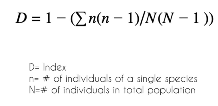
Even though the Simpson’s index was theorized for measuring biodiversity in ecology, the variables of the formula could be replaced by the ethnicity values in London respecting the same mathematical logic. By applying this methodology, values of diversity were generated for each ward. These values vary from 0 to 1, where the lowest values represent a low diversity of ethnicity in the ward and high values a high diversity of ethnicity in the ward. This second approach, thus, led the research to a complex understanding of the correlation between all the ethnicities present in each ward of Greater London, producing then one final summarized output of the process.
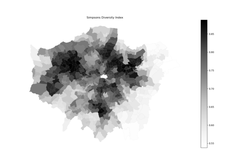
Simpson’s Index of diversity map for the ethnicities of London.
Code:
# Step 2 – Simpson’s Diversity Index
ethnicity_geo[‘dividend’] = 0
ethnicity_geo[‘divisor’] = 0
for e in ets:
value = ethnicity_geo[e] * (ethnicity_geo[e] – 1)
ethnicity_geo[‘dividend’] = ethnicity_geo[‘dividend’] + value
ethnicity_geo[‘divisor’] = ethnicity_geo[‘divisor’] + ethnicity_geo[e]
ethnicity_geo[‘Index’] = 1 – (ethnicity_geo[‘dividend’] / (ethnicity_geo[‘divisor’] * (ethnicity_geo[‘divisor’] – 1)))
ethnicity_geo.to_file(‘ethnicity.geojson’, driver=“GeoJSON”)
ethnicity_geo.plot(column=‘Index’, cmap=‘Greys’, edgecolor=‘grey’, linewidth=0.05, legend=True)
plt.title(‘Simpsons Diversity Index’)
plt.show()
further explorations
For further analysis two other outputs were generated: a bar chart and a filtered map. The bar chart shows the top ten wards of Greater London with the highest values of the Simpson’s Diversity Index. This other format of plotting the data can demonstrate in a more direct way some piece of information, by filtering and ordering the results of the calculations.
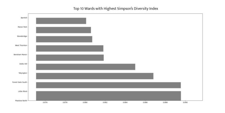
Top 10 ward with highest Simpson’s Diversity Index values
Code:
# Step 3 – Creating a Bar Chart with the top 10 SDI Indexes and the respective Wards
abc = ethnicity_geo.sort_values(by=‘Index’, ascending=False).head(10)
abc_ward = list(abc[‘Ward’])
abc_index = list(abc[‘Index’])
fig = plt.figure(figsize=(10, 5))
plt.bar(abc_index, abc_ward,color=‘grey’, width=0.005)
plt.show()
The filtered map collects the highest values of the Simpson’s diversity index in Greater London. It demonstrates, also in the spatial canvas, which and where are the wards that have the value of the Simposon’s index higher than 0.8.
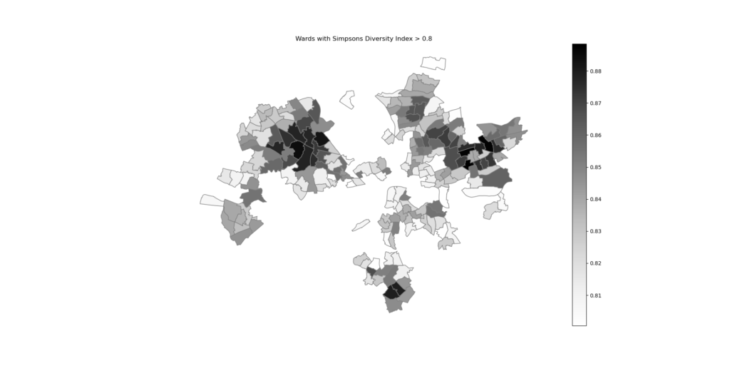
Map of the wards with the higher values of Simpson’s index of diveristy.
Code:
# Step 4 – Mapping Wards with Simpsons Diversity Index > 0.8
sdi_index = ethnicity_geo[‘Index’]>=0.80
filtered_etnicity_geo = ethnicity_geo[sdi_index]
filtered_etnicity_geo.plot(column=‘Index’, cmap=‘Greys’, edgecolor=‘grey’, legend=True)
plt.title(‘Wards with Simpsons Diversity Index > 0.80’)
plt.axis(‘off’)
plt.show()
print(filtered_etnicity_geo)
References
1 – London Datastore – Greater London Authority. (2021). Retrieved 24 November 2021, from https:// data.london.gov.uk/
2- Simpsons Diversity Index. (2021). Retrieved 24 November 2021, from http:// www.countrysideinfo.co.uk/simpsons.htm
Ethnicity in Greater London is a project of IAAC, Institute for Advanced Architecture of Catalonia developed Master in City and Technology in 2021/2022
Students: Júlia Maria Veiga, Kishwerniha Nagoor Meeran Buhari and Maria Augusta Kroetz
Faculty: Diego Pajarito