DayLite

01 Research Framework
Daylighting strategies impact architectural design with regards to occupant health and environmental design. Building occupants require access to daylight for optimal health and well-being. Designers should strive to minimize the use of artificial light to reduce the dependency on unsustainable energy sources. As such, proper daylighting involves a balancing act between allowing visible sunlight into a building, while minimizing glare and overheating.
Energy analysis tools enable designers to analyze daylighting metrics to make informed decisions about building designs. Such tools require an investment in time and training and a general understanding of computational workflows. As such, daylighting strategies present an opportunity to leverage Machine Learning algorithms.
Advances in Machine Learning have recently impacted the building industry, making new technology more accessible to designers. Machine Learning algorithms can augment the creative process from design to construction.
This study describes the research and development of a tool related to Machine Learning supervised predictions for architectural applications, specifically daylighting design. The outcome of this study includes a methodology for predicting daylighting features using Machine Learning. The designs can be evaluated, sorted and filtered, and the selected design can be generated in 3D modeling software and a web application.

Grasshopper script using Ladybug and Honeybee plugins.(2)
Metrics
Spatial Daylight Autonomy (sDA)
Percentage of occupied time that a specific point meets a certain illuminance threshold.
sDA is a measurement of daylight illuminance sufficiency in a given area, which reports a percentage of floor area (>50%) that exceeds a specified illuminance (e.g. 300lux) during a specified percentage of the analysis period. The value of sDA result ranges from 0 to 100%. If the value is above 75%, the daylight in the given space is regarded “preferred”; if it is in the range of 55%-74%, the daylight is “accepted”.(3)
Annual Sun Exposure (ASE)
Percentage of floor area where direct sunlight exceeds 1000 lux for more than a specified number of occupied hours (usually 250).
ASE is the percentage of the horizontal work plane that exceeds a specified direct sunlight illuminance level more than a specified number of hours per year over a specified daily schedule with all operable shading devices retracted. ASE measures horizontal illuminance on an annual basis, which means it is not a glare metric. However, it is developed for preventing excessive daylight that could potentially cause glare issues, which serves as a complementing metric for sDA. The sDA value above 75% indicates sufficient daylight, but it cannot predict excessive daylight that might cause glare or overheat issues. ASE restricts direct sunlight penetration into space. Since the overlit areas are near the windows in most cases, it is strict for daylight design.(3)
Useful Daylight Illuminance (UDI)
Similar to sDA. UDI provides four illuminance ranges, based on a useful range for occupants:
- Underlit, UDI (0-100lux)
- Supplementary, UDI (100-300lux)
- Autonomous, UDI (300-3000lux)
- Exceeded, UDI (>3000lux)
When the 300lux is the threshold, DA (300) = UDI (300-3000lux) + UDI (>3000ux). Given a UDI simulation result, a building space with the concentration of low illuminance might achieve the same UDI value with another space that has more extensive illuminance range including a higher maximum illuminance. The illuminance distribution at a single point-in-time across the year cannot be demonstrated from the numerical value of UDI simulation.(3)
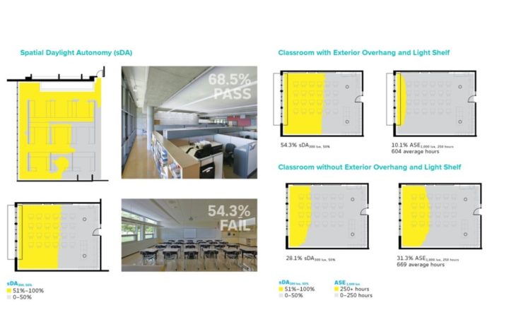
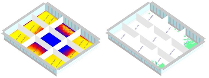
Examples of sDA and ASE.(4)
02 Objectives
User Story
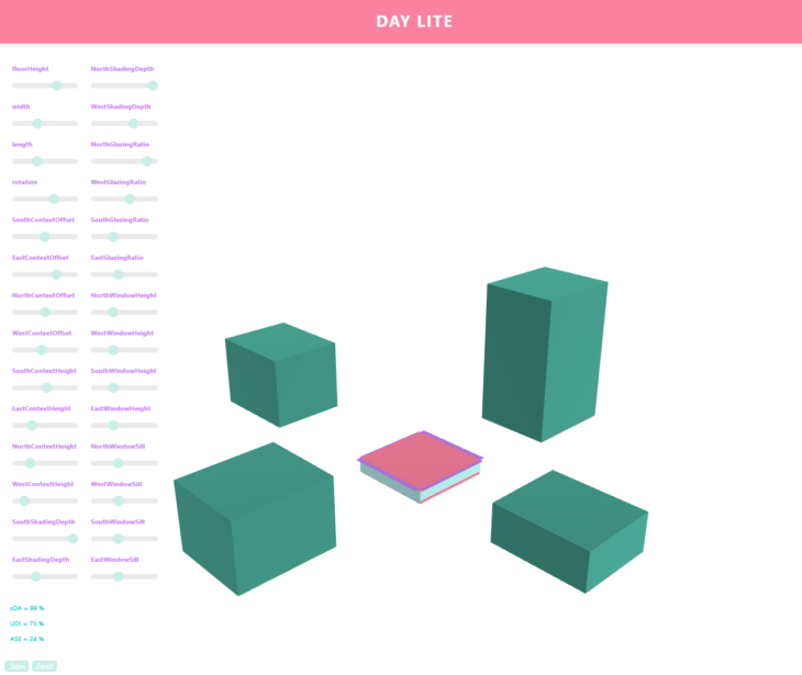
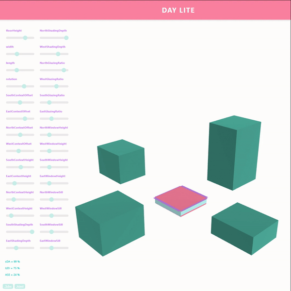
DayLite responds to the issues with daylight analysis tools, which require an investment in time and training. DayLite is a tool related to Machine Learning supervised predictions for quick and easy daylighting design. The designs can be evaluated and the selected design can be generated in 3D modeling software and a web application.

Hypothesis
The purpose of this study is to demonstrate how Machine Learning algorithms can impact building design based on daylighting. The parameters used in this study are the following:
Variable Inputs
- Floor Height
- Room Width
- Room Height
- Room Orientation
- Window Height*
- Window Sill Height*
- Shading Depth*
- Glazing Ratio*
- Context Height*
- Context Offset*
Outputs
- Spatial Daylight Autonomy (sDA)
- Useful Daylight Illuminance (UDI)
- Annual Sunlight Exposure (ASE)
* Each of these features are repeated for each orientation – North, South, East, West. The total number of variable inputs is 28.
03 Methodology
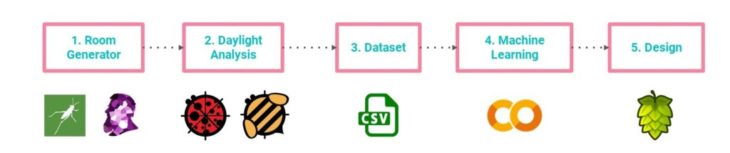
The methodology for executing the study is as follows:
- Develop a computational model to produce a generative dataset of rooms.
- Conduct a Daylighting Analysis on each model.
- Generate a dataset of parameters and features.
- Train a machine learning model with the dataset.
- Represent the predicted outcome in the design space.
Room Generator
Wallacei is a Grasshopper plugin, which is utilized to produce a generative dataset of rooms. Wallacei is an evolutionary engine that allows simulations in Grasshopper 3D through utilising highly detailed analytic tools coupled with various comprehensive selection methods. Additionally, Wallacei provides the ability to select, reconstruct and output any phenotype from the population after completing the simulation.(5)
Fitness Objectives are maximized or minimized randomly to generate the dataset of 2000 site models with various genes. Because the evolutionary algorithm is optimized to obtain the desired fitness objectives, it eventually converges toward the optimal values for certain genes. Additionally, genes that do not have an impact on the fitness objectives, stop mutating with each generation. Typically, in the second half of the simulation, most of the genes stop mutating. To mitigate this, the following strategies were utilized:
- Increase the Mutation Probability – the percentage of mutations taking place in the generation.(6)
- Decrease the Crossover and Mutation Distribution Index – the probability for creating offspring near parent solutions.(6)
- Run twice as many simulations with different fitness objectives and exclude the last half of each dataset.

Daylight Analysis
Ladybug and Honeybee plugins utilize energy simulation engines Radiance and DaySim, to conduct a Daylighting Analysis on each model. The outputs are the following:
- Spatial Daylight Autonomy (sDA)
- Useful Daylight Illuminance (UDI)
- Annual Sunlight Exposure (ASE)
A Grasshopper script is used to run the simulations to calculate sDA, UDI and ASE. The results can be visualized graphically, but for this effort, only the numerical values are of interest to the data encoding machine learning model. The sDA and ASE values are taken directly from the results. The UDI value is calculated by taking the average output for the autonomous UDI range of 300 too 3000 lux.
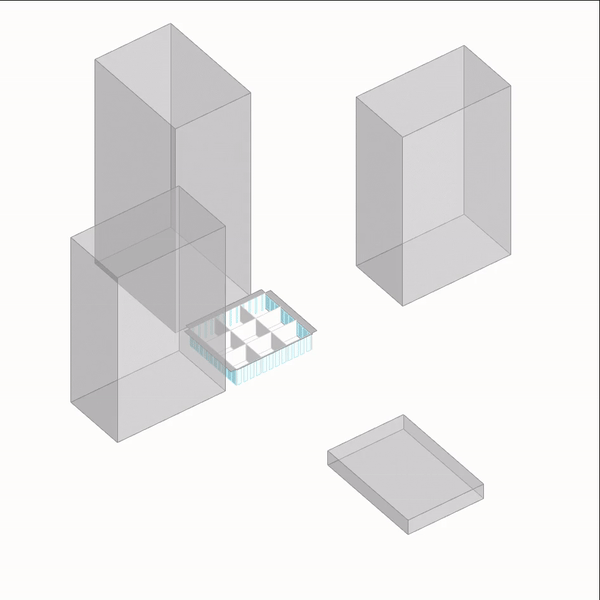
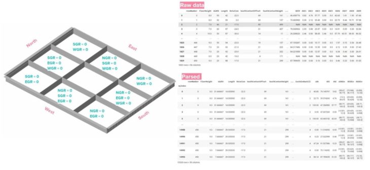
The single storey building can be interpreted as one storey in a multi-level building. To model the layout after real life scenarios, the overall width and length of the building are divided in three, for a total of nine rooms. This creates 9 unique scenarios, where a wall will not have glazing on two or three sides. For each iteration, sDA, UDI and ASE are calculated for each room, resulting in nine times more data. To facilitate the tracking of what output goes with what room, the rooms are labeled 1 to 9 and the results are recorded as sDA1, sDA2, … sDA9, UDI1, UDI2, … UDI9, ASE1, ASE2, … ASE9.
Recall, one of the features is rotation, and several features are related to the cardinal orientations. This has the potential to skew the data. To mitigate this, the rotation feature is limited between -44 and 45. As a result, a room’s North, South, East and West direction is always the same, regardless of the rotation.
The Honeybee plugin contains a component that automatically places windows, given the glazing ratio, window sill height and window height. If the criteria cannot be achieved in the given geometry, the glazing ratio overrides the window sill height and window height. As such, these values can be misleading in the final dataset.
Dataset
The simulation is animated over the dataset, using a C# Script component in Grasshopper that steps through each iteration. Then, using a Python script component, the outputs of the Daylighting Analysis are written to a csv file, The steps taken to prepare the data for the Machine Learning stage are the following:
- Clean data by removing Null values
It takes seven minutes to run the simulation on each building iteration, resulting in 10 days of computing. Crashes and other interruptions cause improper data collection and result in blank rows of data. These can be easily removed.
- Separate 9 rooms
The 9 rooms result in 9 values for sDA, UDI and ASE each. Each building iteration is duplicated 9 times, and one of the nine output values is assigned to a row. For example, row 0 is assigned sDA1, UDI1, ASE1, row 1 is assigned sDA2, UDI2, ASE2, etc. Lastly, the number label is removed from all values and the outputs are renamed – sDA, UDI, ASE.
- Remove center room
The center of the 9 rooms has no glazing. As such, the values for sDA, UDI, ASE will always equal zero. This data will be redundant and is therefore removed from the dataset.
- Glazing Ratio = 0 based on room location
The remaining 8 rooms have skewed glazing ratio data, Based on the room’s location in the 3×3 grid, the glazing ratio for the corresponding cardinal orientation is set to zero. See Figure.
- Binned Data
The resulting output values are grouped into smaller intervals and a number is assigned to each bin. For example sDA values are organized into the following bins: 1 (-0.001, 12.3), 2 (12.3, 38.67), 3 (38.67, 80.77′), 4 (80.77, 100.0)
04 Case Studies
Two cities, on opposite sides of the equator are selected to observe if the machine learning model can make a distinction based on their different locations.
- Buenos Aires, Argentina – Southern Hemisphere
- Thessaloniki, Greece – Northern Hemisphere
At this stage, a new variable: Location, can be introduced into the dataset, where 0 can represent Buenos Aires and 1 can represent Thessaloniki. Another alternative is that the cities can be separated into 2 separate datasets.
Both experiments were conducted, and when the cities were combined into the same dataset, the performance reduced. Typically, more data should improve performance, unless the additional training data is noisy and does not help with the prediction. In this case, there could be a lot of noise with regards to the cardinal orientations. However, the Location variable should have resolved this, thus more analysis is needed to conclude these results.
When the cities were treated as 2 separate datasets, their Machine Learning models performed similarly well. To conclude, this particular model performs best when each city is modeled individually. As such, the following PCA Analysis and Machine Learning model will treat the cities as 2 separate case studies.

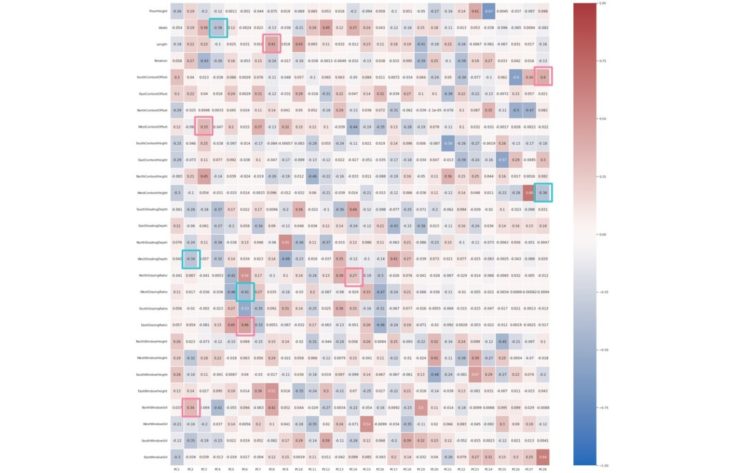
PCA Analysis
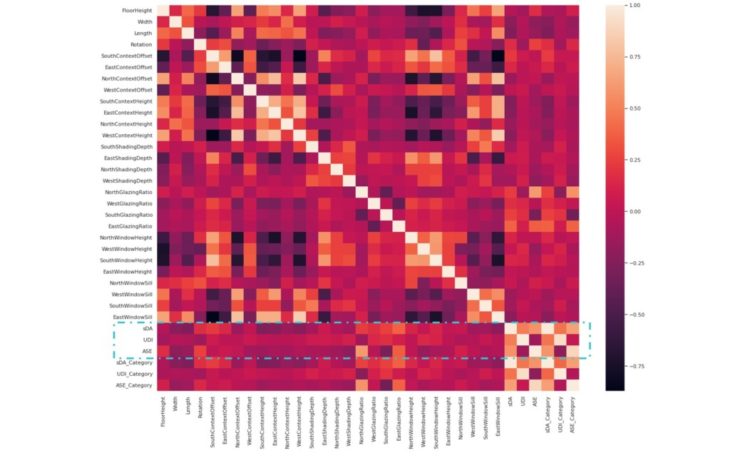
Buenos Aires, Argentina
Correlation Heatmap using Seaborn
Stronger correlation is illustrated by lighter shades and weaker correlation by darker shades.
Observations
Inputs to Outputs
It is useful to observe how the outputs – sDA, UDI and ASE – relate to each of the variables. We can see that North Glazing Ratio and East Glazing Ratio have the strongest correlation to ASE and sDA. Among the four cardinal directions, North and East have the strongest correlation in all the features with all the outputs, Context Height has the weakest correlation to all outputs, as well as Length, Width, South Glazing Ratio and East Window Sill.
Outputs to Outputs
sDA is correlated with UDI and ASE, but UDI and ASE are less correlated to each other.
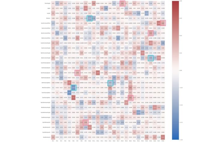
PCA Analysis
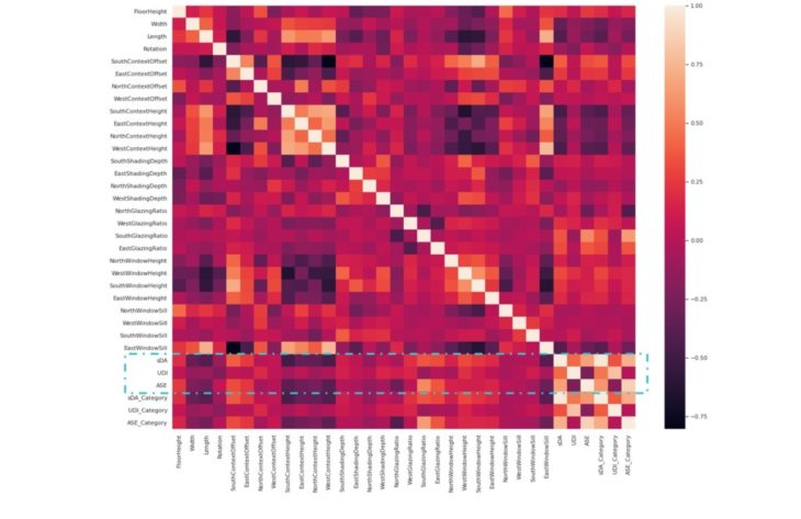
Thessaloniki, Greece
Correlation Heatmap using Seaborn
Stronger correlation is illustrated by lighter shades and weaker correlation by darker shades.
Observations
Similarities can be observed between the 2 case studies, with North and South taking on opposite correlative features.
Inputs to Outputs
We can see that South Glazing Ratio and South Context Offset have the strongest correlation to ASE and sDA. Among the four cardinal directions, South and East have the strongest correlation in all the features with all the outputs, Context Height has the weakest correlation to all outputs, as well as Length, Width, North Glazing Ratio and East Window Sill.
Outputs to Outputs
sDA is correlated with UDI and ASE, but UDI and ASE are less correlated to each other.
PCA Analysis
Buenos Aires, Argentina
Explained Variance Ratio
Explained variance is a measure of how much variation in a dataset can be attributed to each of the principal components generated by a PCA. It refers to the amount of variability in a dataset that can be attributed to each individual principal component. This is important because it allows the ranking of components in order of importance, and the ability to focus on the most important ones when interpreting the results of the analysis. The larger the variance explained by a principal component, the more important that component is. PCA is a technique used to reduce the dimensionality of data. It does this by finding the directions of maximum variance in the data and projecting the data onto those directions. The amount of variance explained by each direction is called the “explained variance.” Explained variance can be used to choose the number of dimensions to keep in a reduced dataset. In general, a model with high explained variance will have good predictive power, while a model with low explained variance may not be as accurate.(7)
Results
The Explained Variance Ratio for the 28 Principal Components range from 0.32359019 to 0.00262562.
PCA Analysis
Thessaloniki, Greece
Explained Variance Ratio
Results
The Explained Variance Ratio for the 28 Principal Components range from 0.25527871 to 0.003734.
PCA Analysis
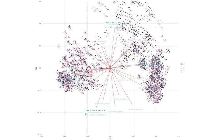
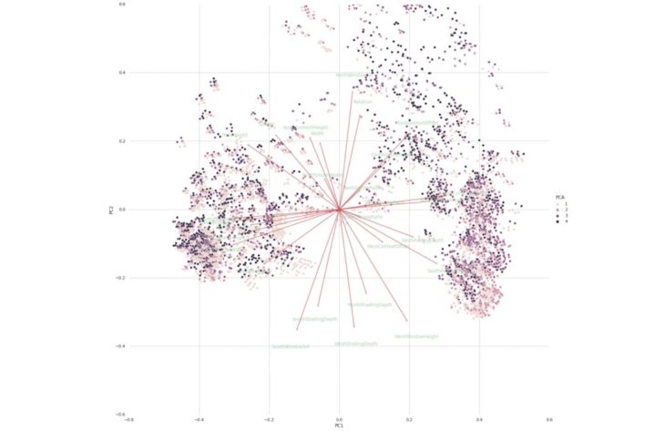
Buenos Aires, Argentina
sDA PCA
A Principal Component Analysis (PCA) captures the essence of the data in a few principal components, which convey the most variation in the dataset. A PCA plot shows clusters of samples based on their similarity. It reduces the number of dimensions by constructing principal components (PCs). PCs describe variation and account for the varied influences of the original characteristics. Such influences, can be traced back from the PCA plot to find out what produces the differences among clusters. The plot also shows how strongly each characteristic influences a principal component.(8)
Observations
The vectors are pinned at the origin of the PCs (PC1 = 0 and PC2 = 0). Their projected values on each PC show how much weight they have on that PC. For example, NorthWindowSill and SouthWindowSill strongly influence PC2, while SouthContextOffset and WestContextHeight strongly influence PC1.
The angles between the vectors indicate how characteristics correlate with one another.(8)
- When two vectors form a small angle, the variables they represent are positively correlated, like WestContextHeight and EastContextHeight .
- When two vectors form a 90° angle, they are not likely to be correlated, like Length and EastContextOffset.
- When they diverge and form a large angle, close to 180°, they are negative correlated, like NorthWindowSill and and SouthWindowSill.
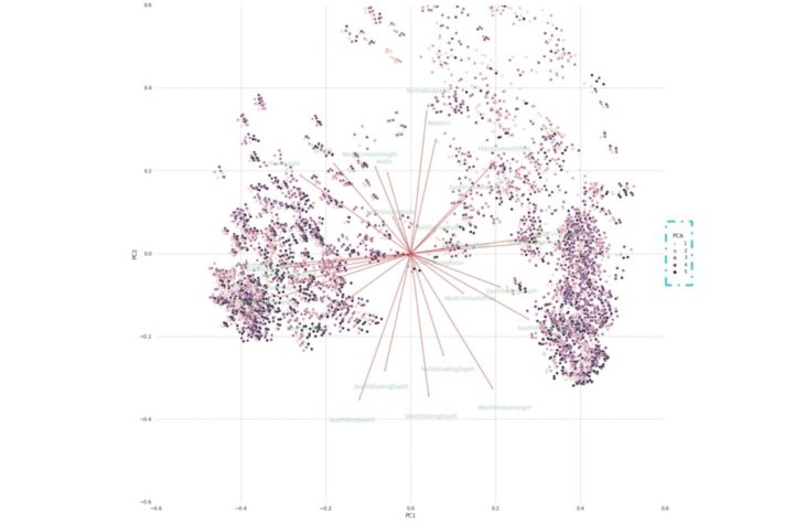
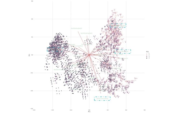
UDI PCA
The PCA plots are similar for the 3 outputs. The colors of the clusters differ because these represent the binned data intervals. sDA and ASE have 4 bins and UDI has 5 bins.
Observations
The lighter shade of clusters represent a lower value for UDI compared to the darker shade seen in the sDA plot.
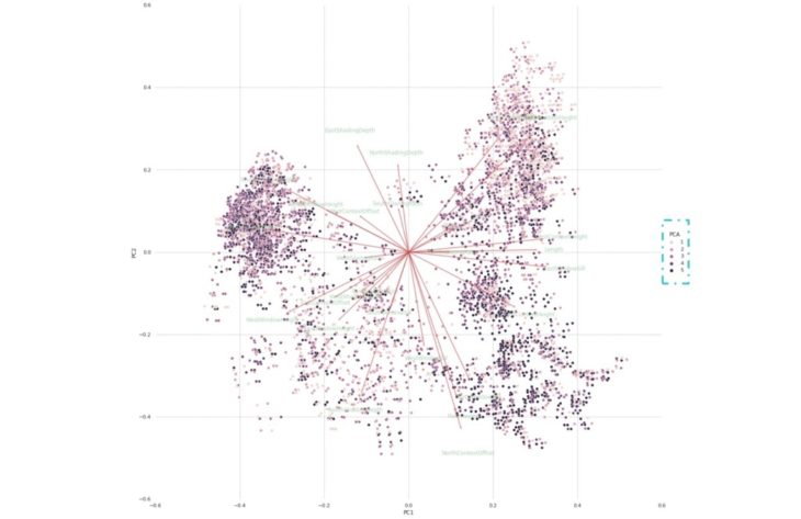
ASE PCA
Observations
The lighter shade of clusters represent a lower value for ASE compared to the darker shade seen in the sDA plot. Furthermore, the colors are distributed differently in the ASE PCA plot compared to the UDI PCA plot.
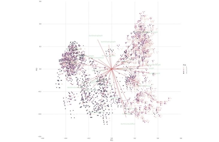
PCA Analysis
Thessaloniki, Greece
sDA PCA
Observations
Similarities can be observed between the 2 case studies, with the features showing different correlations.
The vectors are pinned at the origin of the PCs (PC1 = 0 and PC2 = 0). Their projected values on each PC show how much weight they have on that PC. For example, NorthContextOffset and SouthContextHeight strongly influence PC2, while SouthContextOffset and WestContextHeight strongly influence PC1.
The angles between the vectors indicate how characteristics correlate with one another.8
- When two vectors form a small angle, the variables they represent are positively correlated, like NorthShadingDepth and SouthGlazingRatio.
- When two vectors form a 90° angle, they are not likely to be correlated, like WestWindowHeight and NorthContextOffset.
- When they diverge and form a large angle, close to 180°, they are negative correlated, like EastShadingDepth and and NorthContextOffset.
UDI PCA
Observations
Similarities can be observed between the 2 case studies, in terms of the distribution of shades representing the output values.
ASE PCA
Observations
Similarities can be observed between the 2 case studies, in terms of the distribution of shades representing the output values.
PCA Analysis
Buenos Aires, Argentina
PCA Correlation Matrix Heatmap using Seaborn
The values in the cells indicate the strength of the relationship, with positive values indicating a positive relationship and negative values indicating a negative relationship. Correlation heatmaps can be used to find relationships between variables and to understand the strength of the relationships. The color of the cells makes it easy to identify relationships between variables at a glance.(9)
The PCs listed on the horizontal axis are the most important PCs. The darkest shades are the PCs that are strongly correlated with themselves. Ignoring these cells, we can identify positive relationships in the second darkest shades.
Examples of positively correlated relationships:
- Length and EastWindowHeight (PC8)
- SouthContextOffset and EastWindowSill (PC28)
- WestContextOffset and NorthContextHeight (PC3)
PCA Analysis
Thessaloniki, Greece
PCA Correlation Matrix Heatmap using Seaborn
The PCs listed on the horizontal axis are the most important PCs. The darkest shades are the PCs that are strongly correlated with themselves. Ignoring these cells, we can identify positive relationships in the second darkest shades.
Examples of positively correlated relationships:
- FloorHeight and SouthShadingDepth (PC18)
- SouthContextOffset and EastWindowSill (PC28)
- NorthContextOffset and SouthContextHeight (PC25)
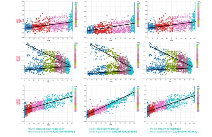
Machine Learning
Buenos Aires, Argentina
Linear Regression
The plots indicate the data follows a linear regression model. Linear regression is a linear model that assumes a linear relationship between the input variables (x) and the output variable (y). As such, the output can be calculated from the input variables.(10)
Three different Linear Regression Model algorithms are tested.
- sklearn Linear Regression
sklearn Linear Regression uses ordinary least squares Linear Regression.
- XGBoost Regressor
Extreme Gradient Boosting (XGBoost) provides an efficient implementation of the gradient boosting algorithm.11 This model results in the highest performance.(11)
- sklearn Kernel Ridge
Kernel ridge regression combines ridge regression with the kernel trick.(12)
Observations
sDA and ASE have similar results, but ASE is the most distinctly linear model.
UDI has a positive and negative sloping linear model.
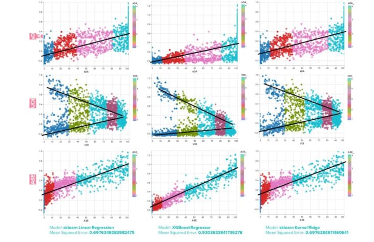
Machine Learning
Thessaloniki, Greece
Linear Regression & PCA
As mentioned, the PCA analysis can help distinguish between the features that are contributing to making successful predictions and the features that are just noise.
When experimenting with removing certain features, the performance of the model actually decreased, so ultimately all 28 features are included in the dataset.
Observations
Similarities can be observed between the 2 case studies. When observed separately, the values for Mean Squared Error are nearly equal for each city.
When combined into the same dataset, the Mean Squared Error values were reduced to the following values:
- Model: sklearn Linear Regression | Mean Squared Error: 0.435850466
- Model: XGBoost Regressor | Mean Squared Error: 0.835244762
- Model: sklearn Kernel Ridge | Mean Squared Error: 0.435850289
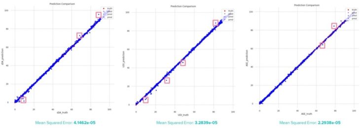
Plot Error
Thessaloniki, Greece
Buenos Aires, Argentina (similar)
Prediction vs Truth Plot Observations
By plotting the prediction value against the truth, outliers can be identified. The outliers appear to be located around the highest and lowest values.
ASE has the lowest error, which makes sense because it has the most distinctly linear model. As such, predictions can be more accurate.
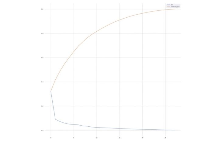
Machine Learning
Thessaloniki, Greece
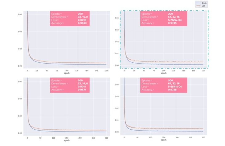
Loss Function
Plotting the loss function indicates whether a model is underfitting or overfitting. Furthermore, calculating the Loss and Accuracy determines the model performance.
Experimenting Loss Function Parameters
Increasing the 3 dense layers from 32, 16, 8 to 64, 32, 16 has the result of increasing accuracy and decreasing loss.
Increasing the number of epochs results in higher accuracy, but some overfitting, ultimately resulting in lower accuracy and higher loss.
Based on the experiments, the following parameters were used in the web application:
Epochs = 200
Dense layers = 64, 32, 16
Removing Window Height and Window Sill Height
Recall that the Honeybee plugin contains a component that automatically places windows, given the glazing ratio, window sill height and window height. If the criteria cannot be achieved in the given geometry, the glazing ratio overrides the window sill height and window height. As such, these values can be misleading in the final dataset. As a test, the Window Height and Window Sill Height were removed from the dataset to observe if the model would perform better. It performed slightly worse, indicating that even if the data is not totally accurate, it still contributes to a higher performance overall.
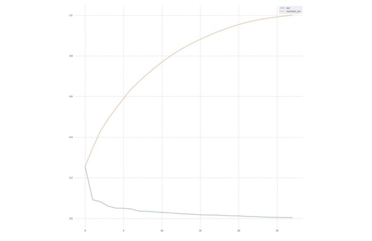
Machine Learning
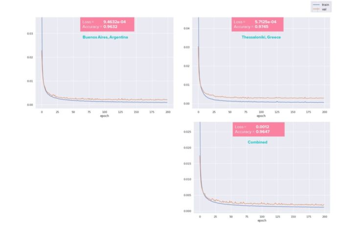
Observations
Similarities can be observed between the 2 case studies in terms of their Loss, Accuracy and the Loss function curve.
When combined into one dataset, the Loss is increased, which indicates worse performance and the Accuracy is less than Thessaloniki, but greater than Buenos Aires.
Considering the combined dataset contains 27000 rows of data with 29 features, it is likely that the reduced performance is caused by too much noise. More analysis is required to improve the combined model. Strategies include identifying and removing outliers and any features that do not contribute to successful predictions.
05 Deployment
Hops
Thessaloniki, Greece
Grasshopper Hops
Using the grasshopper hops server and flask ngrok, the machine learning model can be brought back into grasshopper and tested on new models.
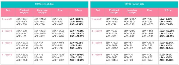
30 rows of data were excluded from the training set to allow for testing during deployment.
Testing was conducted after collecting 8000 rows of cleaned data and the percent error was higher than desired. More data was collected for a total of 13000 rows of cleaned data. In some cases the percent error is worse, but overall the results significantly improved.
This proves that even more data would improve the model. However, since computing time is significantly long – 24 hours per 200 iterations – no additional data was collected, as there is enough evidence to meet the proof of concept.
Web Application
Thessaloniki, Greece
Web Application
Using the Rhino Compute AppServer, the grasshopper definition can be hosted in a web application.(13) This workflow uses grasshopper hops to define inputs which recreate the site model. Then, using flask ngrok, predictions can be made on new rooms. The files needed to run the workflow can be found in the GitHub repository:
https://github.com/ama-gio/daylite
Challenges
Prediction Discrepancy
When comparing the results in the web application with the results from running flask ngrok in grasshopper, the expectation is that the predictions would be in sync. Yet, for whatever reason, there is a discrepancy between the two results. To correct this, the initial input values that get applied when launching the application are made equal to the starting values in grasshopper. This reduced the discrepancy, but they are still plus or minus 2 integers off.
Window Height and Window Sill Height
As expected, deploying the web application for the first time resulted in several errors. After some troubleshooting, it was determined that the Honeybee component that automatically creates windows was causing the issues, so it was removed from the grasshopper script and native grasshopper components were used to create the windows instead. The geometry had to be simplified, so Window Height and Window Sill Height don’t actually change the geometry, but they still contribute to the predicted output.
06 Conclusions
Objective
Recall the objective is to address the issues with daylight analysis tools, which require an investment in time and training.
DayLite is a tool for quick and easy daylighting designs, which can be evaluated and can be generated in a web application.
The research project has been successful in terms of creating a fast and easy alternative to daylight analysis tools. The reliability is still questionable, however more data will significantly improve the accuracy of the results.
Next steps
Aspects of the workflow that could be improved are:
Building Geometry
More variation to the building geometry and implement a method to account for the variation with data encoding.
Data Collection
More data and begin collecting data for cities around the world. Consider combining cities into the same dataset, without reducing performance.
Glazing
Replace the Honeybee glazing generator component with native grasshopper components to create the windows parametrically.
Deployment
Currently, flask ngrok requires a Google Colab notebook to be open while the app makes requests. This limits the ease of sharing the web application with the public. The next steps would be to run Flask as a server, and deploy that server to Heroku.
07 Bibliography
- Theodore Galanos. DaylightGAN GitHub Repository. GitHub. Retrieved August 29, 2022, from
https://github.com/TheodoreGalanos/DaylightGAN
- Hydrashare. (2015, November 9). Honeybee Annual Daylight Simulation Example. Retrieved August 29, 2022, from
http://hydrashare.github.io/hydra/viewer?owner=mostaphaRoudsari&fork=hydra_1&id=Honeybee_Annual_Daylight_Simulation_Example&slide=0&scale=1&offset=0,0
- Ji, G. J. (2020). Daylight Availability and Occupant Visual Comfort In Seattle Multi-Family Housing. 93–102.
- Wymelenberg, Mahi?, K. W., A. M. (2016, April 12). Annual Daylighting Performance Metrics, Explained. Architect Magazine. Retrieved August 29, 2022, from
https://www.architectmagazine.com/technology/lighting/annual-daylighting-performance-metrics-explained_o
- Wallacei About. Wallacei. Retrieved August 29, 2022, from
https://www.wallacei.com/about
- Makki, M., Showkatbakhsh, M. and Song, Y. (2019) ‘Wallacei Primer 2.0’, [Online]. Available at
https://www.wallacei.com/
- Kumar, A. K. (2022, July 1). PCA Explained Variance Concepts with Python Example. Vitalflux. Retrieved August 29, 2022, from
- BioTuring Team. (2018, June 18). How to read PCA biplots and scree plots. Medium. Retrieved August 29, 2022, from
https://bioturing.medium.com/how-to-read-pca-biplots-and-scree-plots-186246aae063
- Kumar, A. K. (2022, April 16). Correlation Concepts, Matrix & Heatmap using Seaborn. Vitalflux. Retrieved August 29, 2022, from
- Brownlee, J. B. (2016, March 25). Linear Regression for Machine Learning. Machine Learning Mastery. Retrieved August 29, 2022, from
https://machinelearningmastery.com/linear-regression-for-machine-learning/
- Brownlee, J. B. (2021, March 12). XGBoost for Regression. Machine Learning Mastery. Retrieved August 29, 2022, from
https://machinelearningmastery.com/xgboost-for-regression/
- scikit learn. KernelRidge. Retrieved August 29, 2022, from
https://scikit-learn.org/stable/modules/generated/sklearn.kernel_ridge.KernelRidge.html
- Luis E. Fraguada, Steve Baer, Will Pearson. Rhino Compute AppServer GitHub Repository. GitHub. Retrieved August 29, 2022, from
https://github.com/mcneel/compute.rhino3d.appserver
- Jastrzebska, A. J. (2022, October 21). Design Space Exploration With Variational Autoencoders. IAAC Blog. Retrieved August 29, 2022, from
- Hakimi, D. H. (2021, December 25). Lumens Calculator: How to Determine Total Required Lumens for Your Space. Alcon Lighting. Retrieved August 29, 2022, from
- Illuminance – Recommended Light Level. Engineering Toolbox. Retrieved August 29, 2022, from
https://www.engineeringtoolbox.com/light-level-rooms-d_708.html
08 Credits
DayLite is a project of IAAC, Institute for Advanced Architecture of Catalonia developed in the Master of Advanced Computation in Architecture and Design 2021/22 Student: Amanda Gioia Thesis Advisor: Angelos Chronis