Introduction:
The project aims to understand Barcelona’s key demographic indicators to help select a suitable barrio for the ‘Internet of Buildings’ design studio. The project brief intended us to create an interactive dashboard and we’ll further explore how to achieve this process. Data visualization can be added through different programs and software today we’ll be exploring Plotly Dash.
Step 1: Create & clean the dataset
First, We acquired the necessary datasets like Population, Household Income, Age, Ethnicity & Number of schools per district through Open databcn. These datasets were then joined to a single base shapefile of the Barrios of Barcelona and the process was achieved using QGis. Next, To work with Dash plotly it is important to use GEOJSON files as this is the most suitable and compatible. Ensure while saving to set an id this can be found under the Custom options>Layer> “feature_id”=BARRI. We also extract a CSV version of this file to co-relate data.
Step 2: Defining the app components & layout
Libraries used:
from dash import Dash, dcc, Output, Input, html
import dash_bootstrap_components as dbc
import plotly.express as px
import pandas as pd
After Importing the necessary libraries we start by defining the layout of the page. The Dash Bootstrap component helps us use an easier way to control the layout by importing its various themes and ‘Journal’ was the theme used. It is a user-friendly experience to define the layout of the page from setting the title to the dropdown menu to the maps as the lines of code get shortened by half rather than using the CSS method. It works by defining a container and setting rows i.e the horizontal portions of the screen and under which columns of content can be defined.
So we begin by building out components which are known as the markdown, Graph, and dropdown. The Markdown contains a property known as ‘children’ which helps store the data of the column you would require. The Graph helps build the figure, maps, or plots while the dropdown helps you navigate and change the parameters according to the user.
app = Dash(__name__, external_stylesheets=[dbc.themes.JOURNAL])
mytitle = dcc.Markdown(children='')
mygraph = dcc.Graph(figure={},selectedData=None)
dropdown = dcc.Dropdown(options=df.columns.values[4:],
                        value='pop_ine21',  # initial value displayed when page first loads
                        clearable=False)
Next, We define the layout of the page using the bootstrap components container. It works by defining the rows which is the horizontal portion of the screen which goes up to a width of 12 columns in total. Under these rows, you set the columns which help us connect our Graphs to the layout and the size of them can be set here.
app.layout = dbc.Container([
    dbc.Row(
        dbc.Col(html.H1("DEMOGRAPHIC DATA ANALYSIS - BARCELONA",
                        className=' text-center font-weight-light text-muted mb-4'),
                width=12)
    ),
    dbc.Row([
        dbc.Col(html.H1([mytitle],className=' text-right font-weight-light text-muted'), width=6)
    ], justify='right'),


    dbc.Row([
        dbc.Col([dropdown], width=8),
        dbc.Col([mygraph],width=8),
        dbc.Col(dcc.Graph(id='table', figure={}),width=4)
    ], justify='right'),
], fluid=True)
Step 3: The Callback function
Using the callback function helps us define the graph which can be a map and bar chart in our scenario. It is the main area where we define the input and set the parameters for the output in the way the user would be intended to use the page. When the user opens the page the bar chart and map are displayed according to the dropdown menu options. Once we want to analyze only specific Barris, we can do a selection on the map to the Barris would to be in focus and the bar chart updated accordingly to the selection.
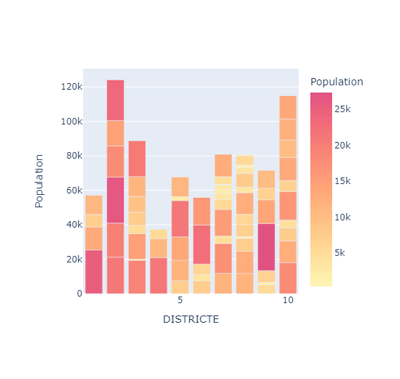
@app.callback(
    Output(mygraph, 'figure'),
    Output(mytitle, 'children'),
    Input(dropdown, 'value')

)
def update_graph(column_name):  # function arguments come from the component property of the Input

    print(column_name)
    print(type(column_name))

    import json
    with open('..BCN_Analysis4326-trial2.geojson') as f:
        Barcelona = json.load(f)


    fig = px.choropleth_mapbox(df, geojson=Barcelona, locations='BARRI', color=column_name,
                               color_continuous_scale="pinkyl",
                               mapbox_style="carto-positron",
                               zoom=10, center={"lat": 41.3874, "lon": 2.1686},
                               opacity=0.5)
      return fig, '# ' + column_name
@app.callback( Output('table', 'figure'), Input(mygraph, component_property='selectedData'), Input(dropdown, 'value') ) def update_side_graph(slct_data, column_name): dff2 = df.copy() # Filter Barrios ids if slct_data is not None: slct_ids = [] for pt in slct_data['points']: slct_ids.append(pt['pointIndex']) dff2 = dff2[dff2.BARRI.isin(slct_ids)] fig2 = px.bar(data_frame=dff2, x="DISTRICTE", y=column_name,color=column_name,color_continuous_scale='pinkyl') return fig2
The video highlights the different dropdown options and how the bar chart and map update according to the 5 key indicators.
The second video portrays that if the map has a selection of certain Barris then the bar cart updates according to selection.
Conclusion:
Dashboards are a fun, informative, and interactive way of visualizing data to make it more user-friendly. Plotly dash is a great tool to further create more informative and detailed dashboards.
Data Source:
Open Data BCN
Tutorial source:
Plotly Beginner’s Tutorial – www.youtube.com/watch?v=7m0Bq1EGPPg&t=958s
Plotly Bootstrap guide – www.youtube.com/watch?v=0mfIK8zxUds
www.bootstrapcdn.com/bootswatch/
hackerthemes.com/bootstrap-cheatsheet/#w-100
Connecting data through plots – www.youtube.com/watch?v=G8r2BB3GFVY
‘Barcelona Demographic Analysis’ is a project of IAAC, Institute for Advanced Architecture of Catalonia developed in the Master in City & Technology 2020/21 by Students: Jiyun Lee, Joseph Bou Saleh & Kishwerniha Nagoor Meeran Buhari and Faculty: Diego Pajarito & Faculty Assistant: Tugdual Sarazin