How can we take advantage of all data collection and management tools to generate and manage data for our research?
Different research paths were taken to explore the capabilities of these tools, that we classified into Static and Dynamic data.
Static Data.
How scrapy can help us to generate new data not available openly?
Thanks to scrapy we were able to analyze rental platforms like Spotahome, scraping the addresses of 6931 properties the platforms offers in Barcelona. After that we took the addresses into OpenCage which allowed us to generate coordinates and plot the precise location of these into a map.
On the same way, this would allow us to scrap the same information for other cities like Madrid, Rome, London, Paris… where the platform is operational.
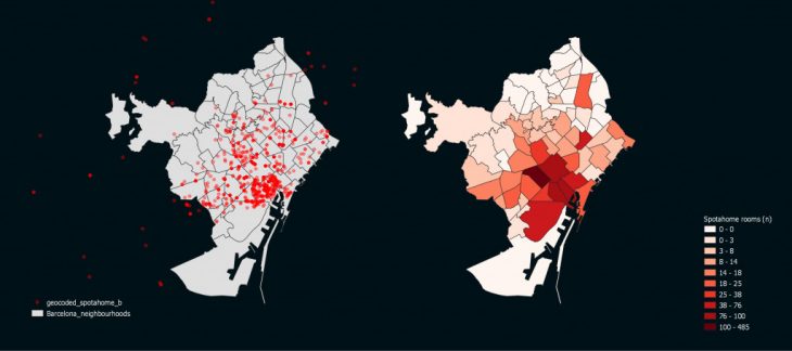
Geolocation of scraped rooms of Spotahome platform
At the same time, several databases were crossed over in QGIS, generating maps slot gacor that would allow us discover new interesting phenomenons on the city of Barcelona. If we overlay the Index RFD (at a Neighborhood scale) with the Airbnb price in a block scale we can perceive certain areas where the contrast is higher and consequently a potential conflict to be studied further.

Index RFD versus Airbnb prices
Dynamic Data.
The rapid change of cities is generating extraordinary circumstances that cannot be tackle using what ‘static’ analysis. Information needs to be tracked more dinamically, through time and not just space. This is why we decided to use Twitter data to be able to understand the behavioural urban patterns that happens on the city.
We started by ploting the number of Tweets into a grid and then comparing with the commercial activities. This shows then were people are being more active within a high dense commercial area.
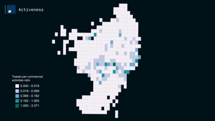
Density of tweets plus density of commercial activities
Going further into the research and thanks to phyton and geopandas we were able to represent an abstraction of the actual movement of the Tweet Users. The following image is showing one year of geolocated Tweets of Barcelona (white dots) and the lines represents those Tweets made by a same user. Consequently, if a user Tweeted in the morning and then again in the afternoon, the pink lines would show his movement through the city.
If we get closer and zoom up into the city it becomes interesting to see that the geolocated Tweets start drawing the Cerdà grid of Barcelona and specific clusters of Tweets driven by iconic and known touristic places of Barcelona.
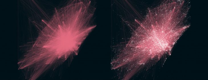
Geolocated tweets and path of Twitter User
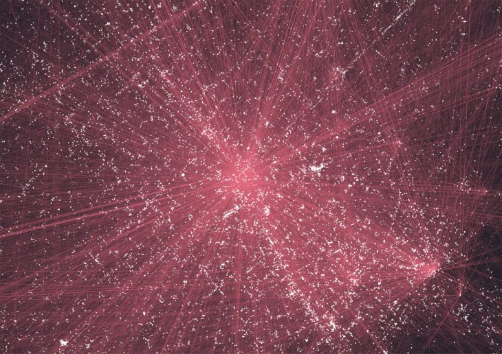
Close up of Tweets and path of Twitter User
In order to get more specific a code was ellaborated to create a timestamp in order to show the number of Tweets in a grid (number of Tweets per cell) every minute of a specific day.
Given this, the next step in our research will be to try to find more accurate ways to understand the static and dynamic urban patterns of the Barcelona, including a more complex system of parameters and trying to find other sources of people movement that might be interesting of study.
‘Barcelona & Big Data. Static and Dynamic’ is a project of IaaC, Institute for Advanced Architecture of Catalonia developed at Master in City & Technology in (2019/2020) by:
Student: Andrew Saltzman, Kushal Saraiya, Alejandro Quinto, Jianne Libunao
Faculty: Diego Pajarito