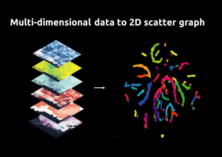
 In this workshop, a methodology is developed to combine multi-dimensional spatial data to identify and visualize patterns and typologies in maps. A machine learning algorithm (T-SNE) is used to transform the multi-dimensional data into a two-dimensional graph. Afterwards, the results in the graph are clustered representing each typology. Finally, the typologies are visualized in a map, locating them in the urban area. This method also allows to recognize patterns and correlations between the data layers or parameters that are chosen to be analyzed with the algorithm.
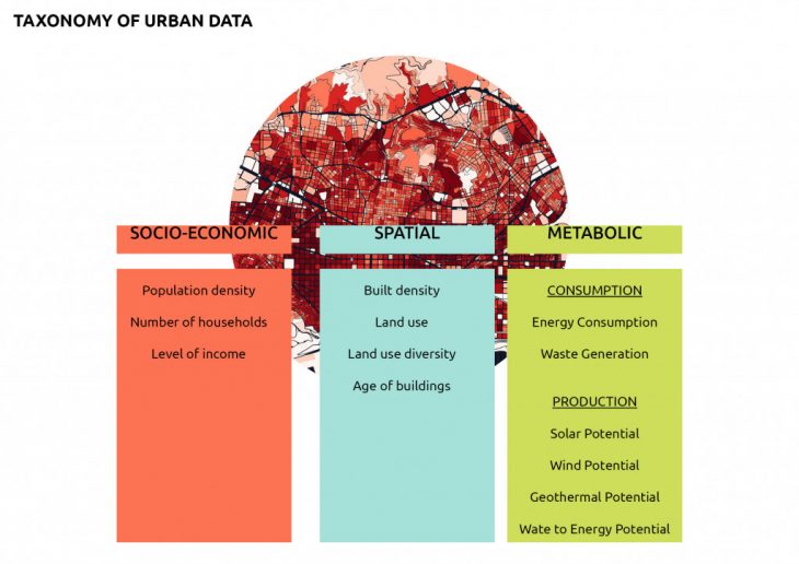
The Data:
The data is categorized into three groups of socio-economic, spatial, and metabolic.
The Algorithm:
T-distributed Stochastic Neighbor Embedding (T-SNE) is a machine learning algorithm for visualization developed by Laurens van der Maaten and Geoffrey Hinton. While t-SNE plots often seem to display clusters, the visual clusters can be influenced strongly by the chosen parameterization, and therefore a good understanding of the parameters for t-SNE is necessary. ( source: Wikipedia)
This algorithm creates a 2D scatter graph of the data values based on the variance of the distribution of the values. The points that are closer to each other in the graph have similar values in the parameters which were chosen in the beginning.
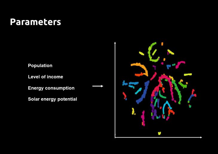
The parameters to test the algorithm:
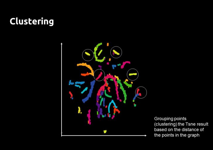
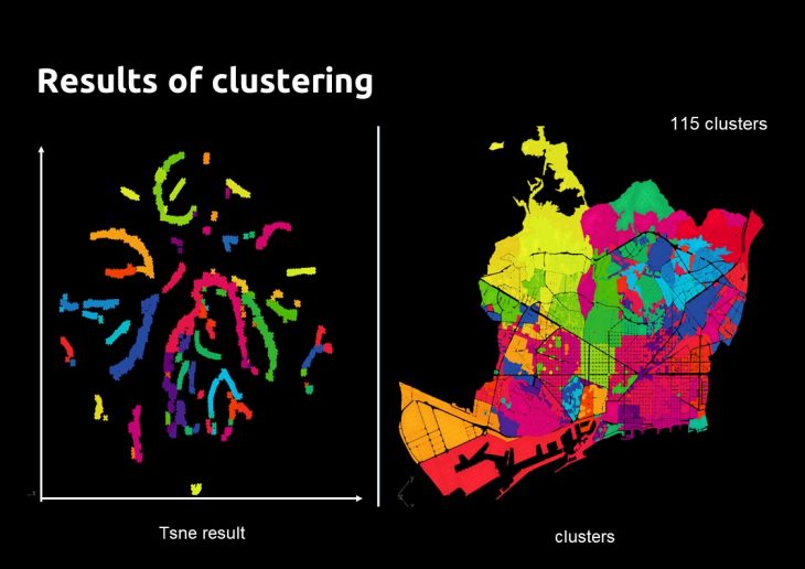
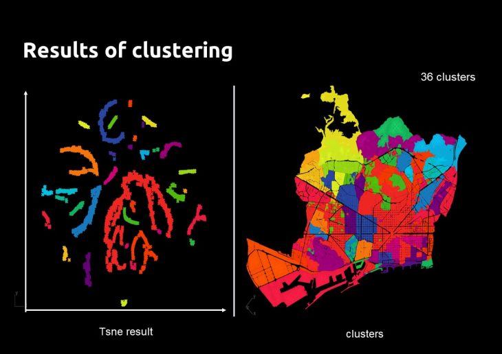
The Clustering:
In order to define typologies (representative of the parameters), those points in the scatter graph are grouped based on their distance. The value of distance chosen, affects the final number of clusters.
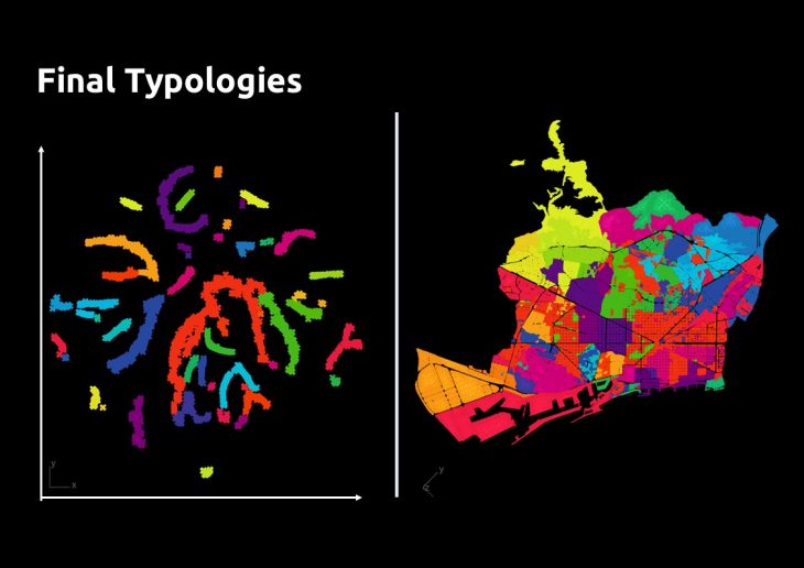
Final Typologies:
The typologies can be based on:
- All the data layers
- Data layers separated per category
- Data layers cross-categorized (spatial + metabolic)
The Typologies shown in the map below are based on the combination of the parameters of Population, Level of income, Energy consumption, Solar energy potential, and a distance of clustering which generates 50 clusters.
Visualization:
Visualization can allow identifying patterns in the data.
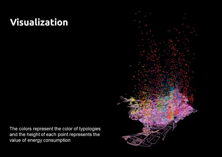
The colors represent the color of typologies and the height of each point represents the value of energy consumption.
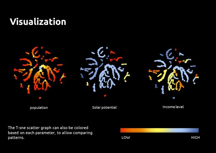
The T-sne scatter graph can also be colored based on each parameter, to allow comparing patterns. (Each point represents one block in Barcelona, and is fixed in the graph). This type of visualization can be used for customized clustering of the data points in the graph.
The relational model for defining typologies developed in this workshop is used for the “Circular Collective Nexus” project by Mahsa Nikoufar.
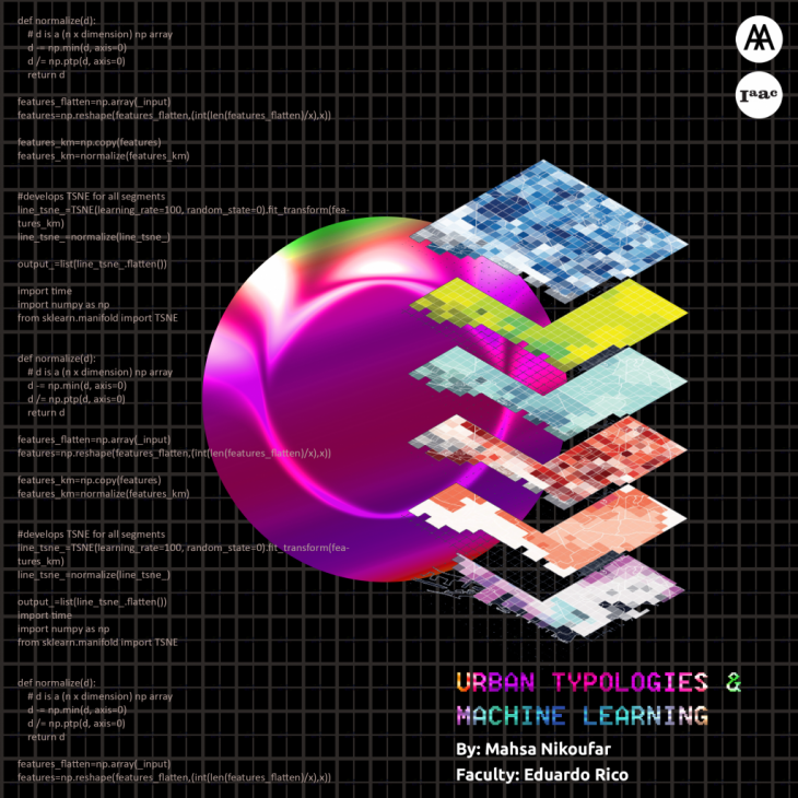
Urban Typologies & Machine Learning is a project of IaaC, Institute for Advanced Architecture of Catalonia developed at Master in City & Technology 02 in (2019/2020) by:
Student: Mahsa Nikoufar
Faculty: Eduardo Rico