Transportation planning decisions influence land use directly, by affecting the amount of land used for transport facilities, and indirectly, by affecting the location and design of development. For example, expanding urban highways increases pavement area, and encourages more dispersed, automobile-oriented development (sprawl), while walking, cycling and public transit improvements encourage compact, infill development (smart growth).
In order to understand the landscape of our city better, a visualization tool should be used to make better decisions and faster spatial analytics. In regards to geospatial tool, Kepler.gl provides a user friendly and interactive visualization that can be used for city officials to convey messages or make ease of decision making.
Kepler.gl
Kepler.gl is a high-performance visualization tool and it is purely a client-side app. It can be easily used by technical and not technical people for visualization, it also supports the flexibility of 3-D visualization. The map made through Kepler.gl is interactive, allowing users to easily zoom, pan, and roll-over points to see data. The points can also be customized to change the color or size depending on the number of rides associated with each point for easier ingestion.
In this trial, datasets such as geolocation of transportation station and population income per neighborhood is used to give visualization and idea of correlation between the two.
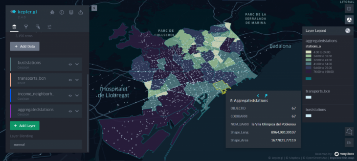
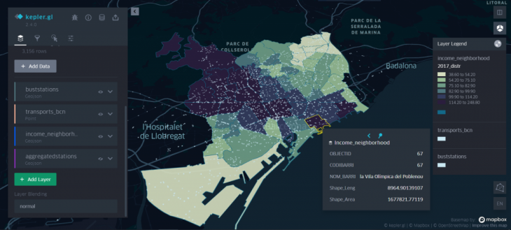 By adding the necessary layers for analysis to the current map allows us to see the borders of each neighborhood. Now because these are two different datasets, we aren’t able to manipulate the attributes of each according to the other.
Transport Network Geospatial Analytics is a project of IaaC, Institute for Advanced Architecture of Catalonia
developed at Master in City & Technology in (2019/2021) by:
Student: Aryo Dhaneswara
Faculties: Diego Pajarito