Introduction
Mobility flows is a research project that aims to tackle the challenge of creating a healthy mobility network in our cities. Understanding the data related to health such as air pollution, noise, and thermal comfort allows designers and city planners to identify risk areas in the network and design specific interventions that can address each of these risks. The project applies this methodology in the area of study in Poblenou, Barcelona.
The data collection and processing methodology we used for this project are summarized below. It was mainly divided into 4 clusters. The majority of the environmental data collected came from open-source data from the official Barcelona geoportal. Other sources of data are described below. The main tools utilized in this project were mainly python data preparation and QGIS for data aggregation and geospatial visualization.

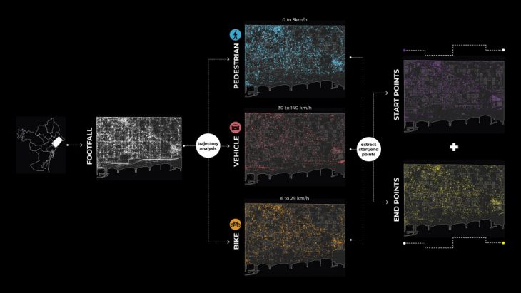
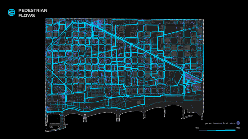
In order to arrive at the final output of the flows, we performed the same operation for 3 different networks; pedestrians, bikes, and vehicles, responding to the 3 dominant modes of transport in our district.
From points to trajectories

In parallel, in order to run the agent’s simulation and calculate the flows in the area, it was necessary to have the start and endpoint of every agent. In order to do so, we based our analysis on data from mobile devices. We consider that this dataset accurately represents the population movements in our study area due to the high precision of the device geolocations.
Agents points: The dataset contains 11 million smartphones timestamped geolocations in all of Spain divided into 7 days.
Geo filtering: Our first steps were to concatenate all the points of all days and apply a geolocation filter to only keep points inside our study area in Poblenou. We also converted these points to EPSG:25830 projection system and only kept timestamp, device_id, and geolocation data. These steps were performed with GeoPandas. We obtained 540, 615 geolocations in our area.
https://github.com/TugdualSarazin/CityGraph/blob/main/CityGraph/main_footfall_merge_filter.py
Convert to trajectories
Moreover, using MovingPandas we converted these device geolocations into trajectories, and thus we obtained 4651 trajectories. However, these trajectories did not represent the real stops of the mobile user. For example, if a person goes from his house to a shop and afterward to the metro station the extracted points would be only the house and the metro stop, or in other words, the first and the final destination. In order to achieve more accurate results, we split trajectories for each stop that lasted more than 2 minutes and was within a diameter of 20 meters. Furthermore, we filtered trajectories of less than 100 meters in order to remove the static or minimum movement from our processed dataset. Finally, we obtained 8439 device trajectories.
https://github.com/TugdualSarazin/CityGraph/blob/main/CityGraph/main_footfall_trajectories.py
Transport mode classification
Each trajectory could be divided into segments between 2 locations and because each location is time-stamped we can compute the speed of each segment with MovingPandas. Afterward, we were able to compute the segment with the maximal speed of trajectories, and based on this maximal speed we classified trajectories by transport mode. The values considered are the following:
- Pedestrian maximum speed from 0 to 5 km/h
- Bike maximum speed from 6 to 29 km/h
- Vehicle maximum speed from 30 to 140 km/h
Moreover, we split these trajectories according to the classification of their transport mode and extracted the start and end points, with the following distribution:
- 4287 pedestrians
- 2407 bikes
- 1455 vehicles
Notes: 290 trajectories are deleted by this step because their maximum speed is above 140 km/h.
The acquired start and endpoints were afterward used by the agent simulator to generate the flows.
https://github.com/TugdualSarazin/CityGraph/blob/main/CityGraph/main_footfall_start_end.py
From network to flows
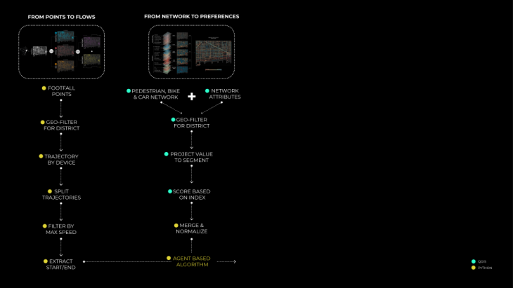
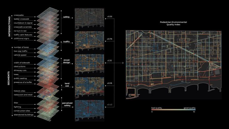
Starting from the pedestrian network of Poblenou, we divided it into segments, splitting the lines at every intersection. This process was done directly in QGIS. This process was necessary, in order to have more accurate values for our pedestrian index, but mainly to simulate the agent’s movement in the next steps of our process.
Afterward, for each segment of the street network, we wanted to assign a number of attributes in order to arrive at our final indexes. These attributes were derived from the Pedestrian Environmental Quality Index (PEQI), a spatial index created by the San Francisco Department of Public Health (SFDPH). We adapted the index for the area of Poblenou and calculated 21 layers.
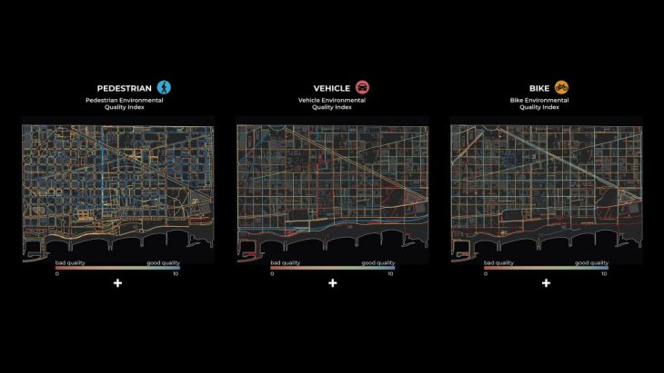
Starting from data collection, the data were geofiltered and projected on the street segments. Furthermore, the values were scored as indicated by the index, merged into 5 categories: Intersection Safety, Traffic, Street Design, Land Use, and Perceived Safety, and normalized again. The 5 clusters were then merged on the final result given specific weights. The purpose of this study is to indicate which streets are more “walkable” or in other words, preferred by pedestrian users.
The same procedure was followed for both the Bike and the Vehicle networks.
Agent based algorithm
This step aims to generate flows of people per transport mode. In order to do that, the algorithm chooses the best network path for each agent. An agent is defined by his footfall start and endpoints. At the end, the algorithm processed the flow score, which is the number of times a street segment (edge) is crossed by an agent. The 3 street networks are exported as a shapefile with their flow score.
Multi-agent algorithm implementation
The implementation of the algorithm is based on a graph model. The 3 road networks (pedestrian, bike, and vehicle) are converted into 3 undirected graphs. Each street segment is represented as an edge and the connection between at least two street segments is represented by a node. Street segments are pavements or pedestrian crossings for the pedestrian network, roads or bike lanes for the bike network, and roads for the vehicle network.
Edges (street segments) store their preference index (pedestrian index, bike index, vehicle index). This index is used by the program to process the best path of each agent. Indeed, the program is based on the Dijkstra algorithm. This algorithm chose the path with the minimal sum of edge weights and the weight is the inverse of the preference index. In other words, a longer path with a good preference index will be chosen besides the shortest path with a bad preference index.
https://github.com/TugdualSarazin/CityGraph/blob/main/CityGraph/simulation/simulation.py#L90
Note: Why not directly use the footfall data to process the number of people per network segment? Because we want to measure the effect of our interventions, we need a tool to simulate it. We also want to have the same methodology before and after our intervention. So we need to use the agent flow simulator on this step.
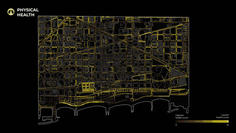
From network to health
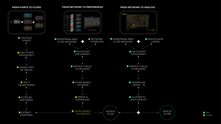
Moreover, to understand the health of each segment of the street network, we started with data related to the three types of health identified in our research. For Physical Health, the layers considered were Air quality ( NO2, PM10, and PM2.5 pollution), Thermal Comfort, and Number of accidents. For Mental Health, the indicators include Noise pollution, Visibility, and NDVI (Normalized difference vegetation index). Finally, for Social Health, indicators include Accessibility, Proximity to Amenities, Proximity to Public Transport, and Proximity to bike and car parking.
To calculate these layers, we used shapefiles (PM10, PM2.5, Noise pollution) provided by BCN open data portal. Another analysis(Visibility, Thermal Comfort) was also done using grasshopper. Some layers were calculated through raster analysis in Qgis (NDVI, N02, proximities) and lastly, accessibility was processed through depthmapX. Moreover, the collected data were filtered only for our area. Afterward, the values were projected on the street segments and normalized so that they could apply to any case study. In other words, the values of all the layers were remapped from 0 to 10. Finally, the processed layers were clustered in the 3 final categories, physical, mental and social health.
The final map depicts the road segments with the lowest health scores for each category.
Conclusion
During the course of the year with Big data tools I, II, and III we have been working with many methods of data collection, processing and analysis. We have used these methods in multiple projects from design studios to seminars. Here, we are presenting outputs from our Internet of Buildings studio project – Mobility flows- to demonstrate these processes starting from data collection to final visualizations. This project was selected as we used most of the methods we got familiar with this year and it is a good example of how raw data can be processed and analyzed to give us valuable insights.
Finally, using these digital tools we were able to process, analyze, combine and understand large loads of datasets. Combining different methods, we produced visual outputs that helped us convey information and support our research project.
Mobility Flow is a project of IAAC, Institute of Advanced Architecture of Catalonia developed at Master in City and Technology in 2020/21 by students: Adriana Aguirre Such, Diana Roussi, Dongxuan Zhu, Hebah Qatanany, Tugdual Sarazin and faculty: Diego Pajarito