Data visualization can be done in many ways and they become useful information to come to a few conclusions. Today, data is open sourced and is easily available on many websites and we can also be contributors of data in many ways.
In this exercise, the aim was to create a map of the bicing stations in Barcelona and the closest bicing stations. Barcelona, being a smart city, is bicycle friendly and has public Bicing as also a means of transport.
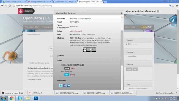
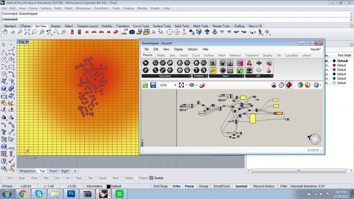
The data was collected from the above website in the .xml format and converted into an excel format. This was later imported to Grasshopper using the LunchBox Plugin.
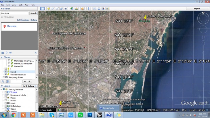
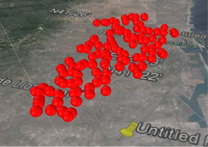
Two reference points were pinned on the Google Earth, noting down the latitude and longitude of the point. These two points are set as references in Grasshopper to get the rest of the point onto the map.
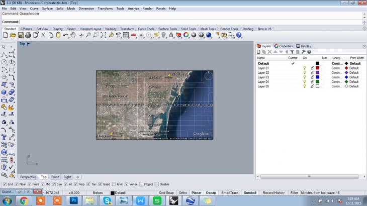
The map is then saves as picture and imported to Rhino using the PictureToFrame command. The map must then be scaled using the reference scale below.
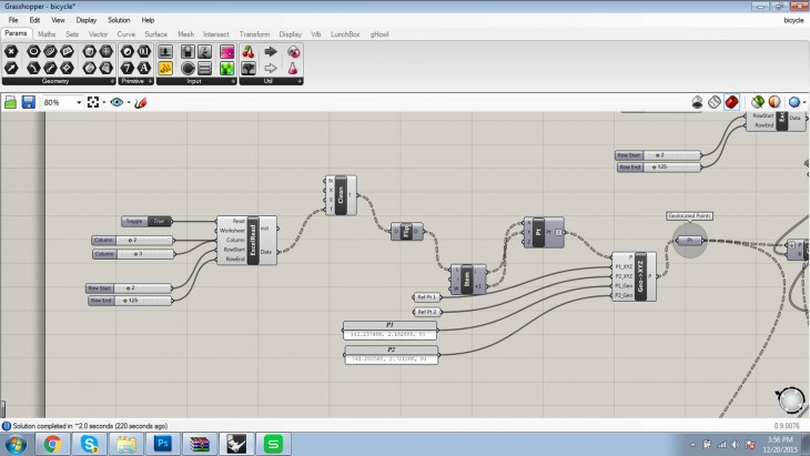
The data was fed into Grasshopper using the LunchBox Plugin. the reference points were set and then the data was used to create a map of the bicing stations.
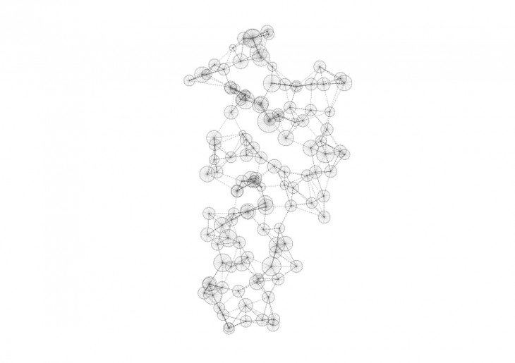
2d visualization with respective to number of bicycles and closest stop
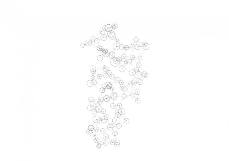
2d visualisation of closest stops
A set of data obtained can be visualised in varies ways, thus the map infers several results from the same set of data.
Data Visualisation is a project of IaaC, Institute for Advanced Architecture of Catalonia developed at Master in Advanced Architecture in 2015/2016 by:
Students: Varsha Subba Rao
Faculty: Luis E. Graguada
