Social Media has become a significant part of the urban fabric. Through analysis and visualization it has tremendous potential to become a tool for city planning and future predictions. However there are a number of debates that think otherwise, and prove that these digital platforms might not be sufficient representation of the city.
This project seeks to find the relationship between the physical and digital aspects of the city of Barcelona. Twitter database (from November 2017-February 2018) represents the digital layer of the city for this project, while the physical includes population, income, airbnb, hotels, and tripadvisor data (local and tourists).
We start off by breaking down the different elements that make up twitter -User Info, Topic, Time, and Place. We try to answer the questions; Who uses twitter? What are they saying? When do they tweet? Where do they tweet from?
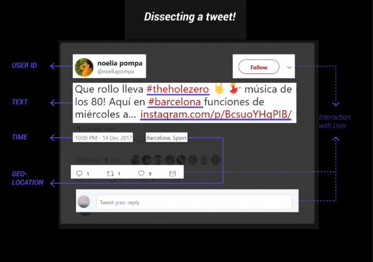
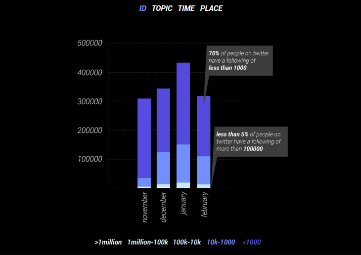
Who uses twitter in Barcelona?

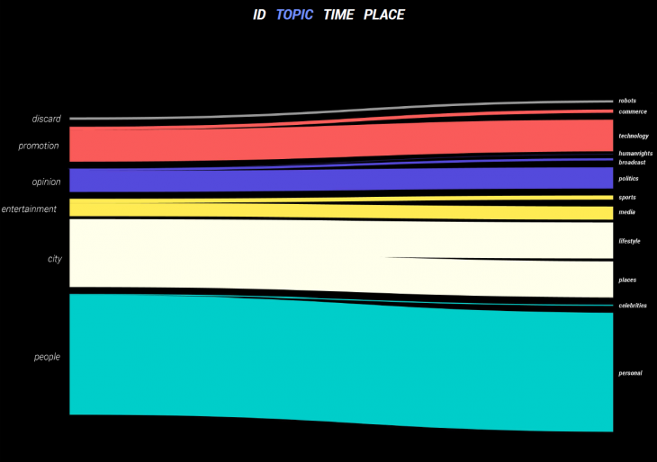
What do people talk about on twitter?
To deduce this, we created a dictionary of 600 of the most occuring words in our twitter database and assigned each a topic under 11 sub-topics as shown below.

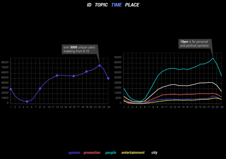
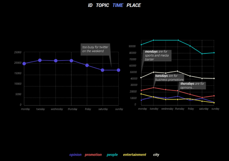
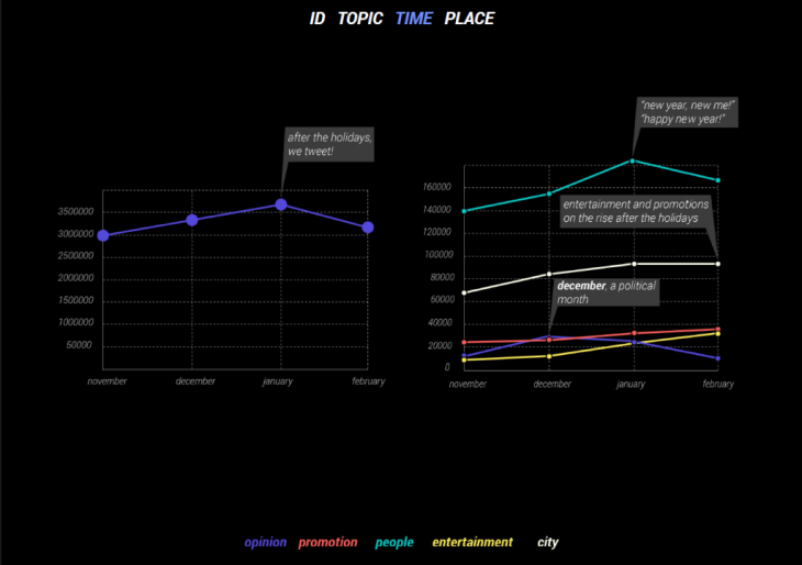
When do people tweet?
Here, we analysed tweets based on an average day, week and through the four months in order to find patterns of tweets in time.
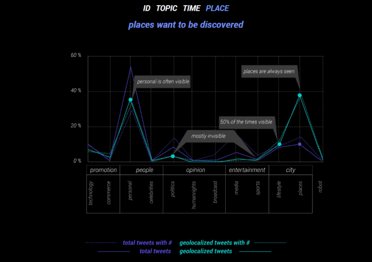
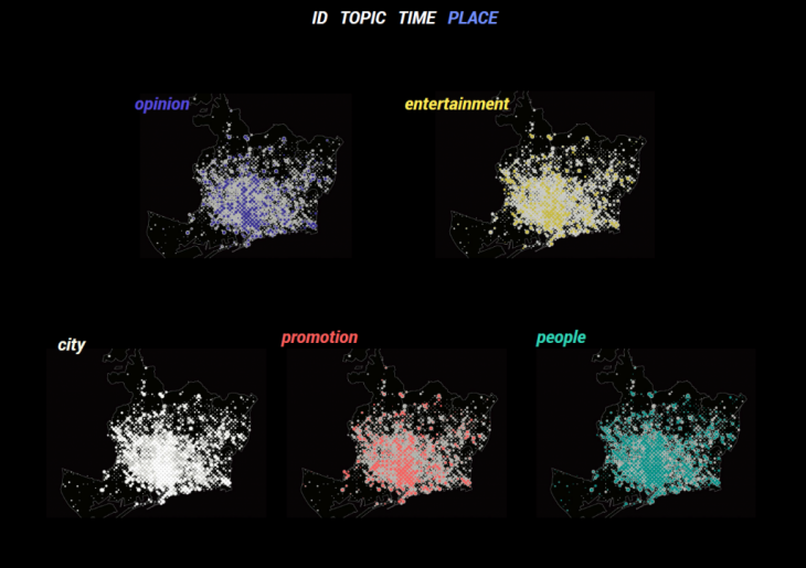
Where do people tweet from in Barcelona?
On average, only 5% of tweets are geolocated. From the chart and map below, it shows that tweets about city and personal tweets are the most geolocated categories.
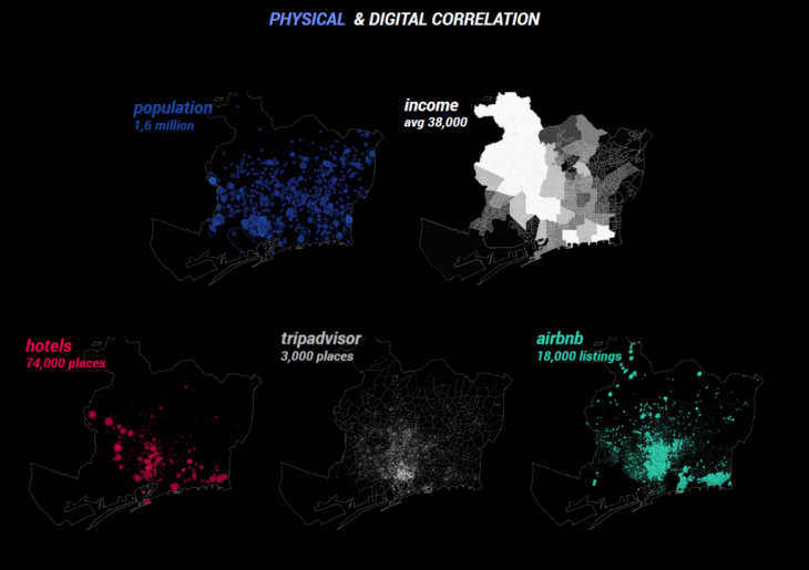
Moving on to the find the relationship between the physical and digital layers of Barcelona, we first map out some of the physical elements used, and then introduce our method of extracting information from the overlap of these two aspects.
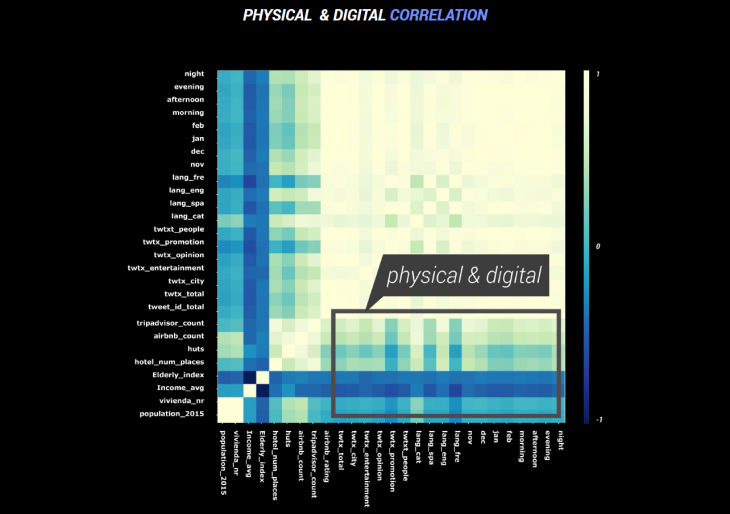
A correlation is a statistical technique used to measure and describe the strength and direction of the relationship between two variables. By using the physical and digital indices as variables, the relationship between different elements in the digital and physical space are read.
In the case of the entire city of Barcelona, the chart below shows a weak correlation between these two layers.
But what happens if we zoom in a bit deeper and consider the different districts of the city instead of just the city as a whole?
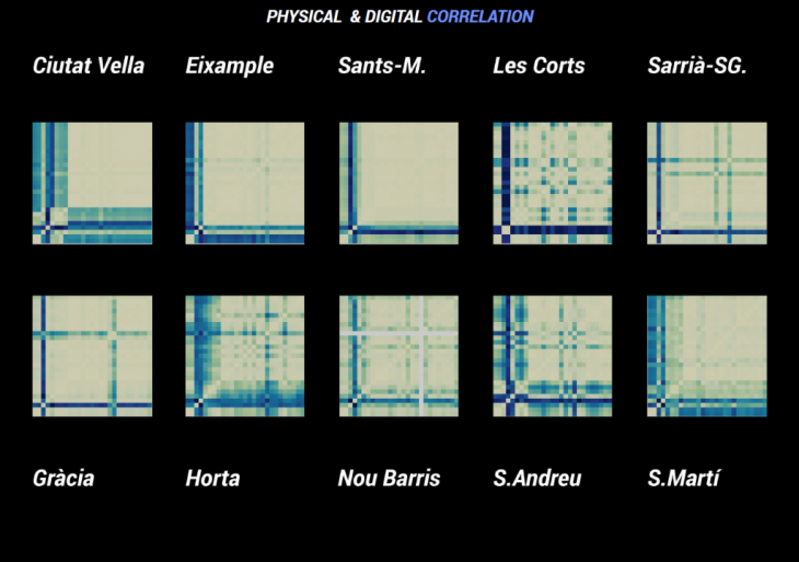
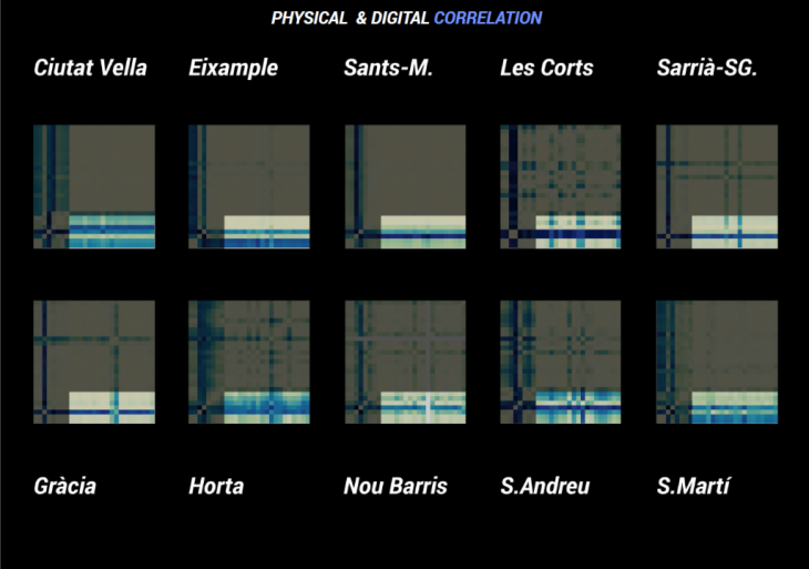
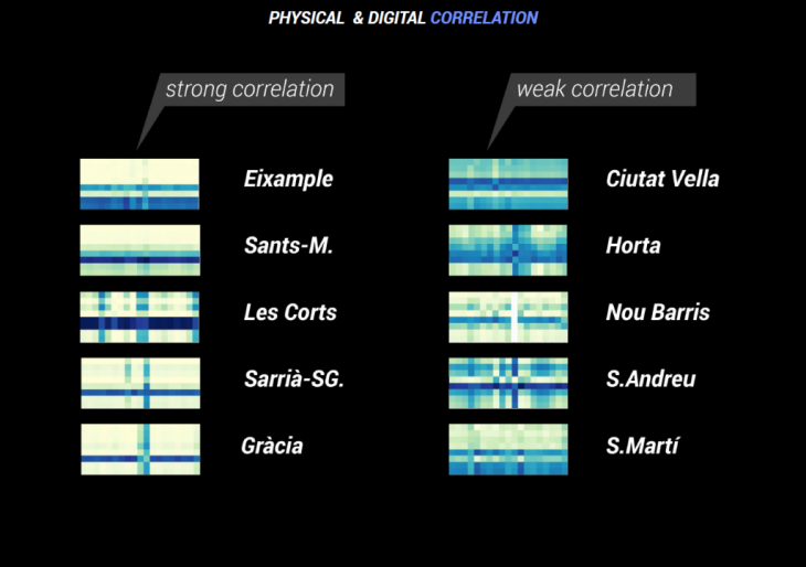
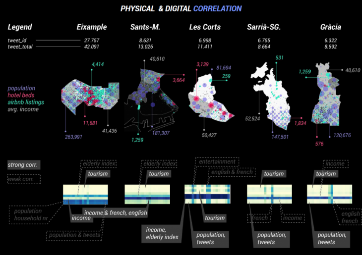
By placing weak correlated and strong correlated side by side, Barcelona seems to be split right in the middle. Although this analysis was done with a limited amount of data- the digital representing only a short time span, and the physical being more dynamic than the index used-how could this method of urban analysis change the way cities are planned? What other insights to the city can we deduce by inputting other dynamic variables over longer periods of time?
Correlation Of Barcelona is a project of IAAC, Institute for Advanced Architecture of Catalonia, developed at MaCT (Master in City & Technology),
2017-18 by:
Students: Alba Alsina Maqueda and Venessa Williams
Faculty: Luis Falcon