About curves: a story of learning and energy
Starting point
The last year has been a challenging one, with plenty of opportunities to learn and show the kind of work we can produce. Working in teams has allowed us to build complex projects considering different perspectives where each of us was bringing our background and experiences. We all learned new skills and how to work in parallel in different projects with different teams, arriving at the last term ready to used all that knowledge on a final big project.
The project of Internet of Building called “Flatten the curve”, proposes a new model of energy that promotes self-generation and self-consumption, it is the perfect project to summarise how we have grown as urban researchers in the last year, adding the “urban-technology” layer to the previous layers that already were defining us.
The project
In this project our aim is to analyze the energy consumption and energy production data of the buildings of the Sant Martí area of Poblenou, to propose active and passive strategies that can bring a new and more sustainable energy model. The name comes from the graphic representation of energy consumption/generation: in fact, this information changes through time, designing curves of energy production and consumption (Figure 1).
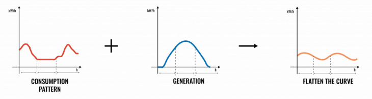
Figure 1. Flatten the curves
These curves are relevant since they show the peak and valley hours of energy consumption, moments where the system suffers more or less stress, and where the price of energy is more or less expensive, especially considering the new regulation of electricity tolls that have been introduced on June 1st, 2021). Considering energy efficiency strategies through building renovation and energy production strategies through photovoltaic installations, the final goal is to facilitate energy exchange between buildings that have an excess of energy and buildings with a demand for energy. By promoting these strategies and the final exchange of energy, we achieve to flatten the final consumption curve (Figure 2).
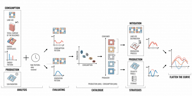
Figure 2. Methodology
Working with data
The challenging aspect of our project has been the creation of a tailor-made dataset that could allow us to generate the different curves per building or block of buildings. This dataset represents the added value of our proposal since it gives specific information on energy consumption and production and at the same time allows us to simulate some energy transition scenarios, showing how different strategies affect the total amount of energy consumed. The main characteristic of our research approach has been the use of dynamic data since we are not only considering energy data as aggregated values (e.g. total energy consumed per building per day) but also as disaggregated one by hours and by seasons (eg. variation of energy consumption along the day or variation in energy production between winter and summer). Therefore, the dataset has been built considering both energy data and territorial data (Figure 3).
Energy data: The energy dataset has been generated focusing on consumption data and production data in considering time as a variable, both hourly and seasonally.
– Consumption side: In order to have data aligned with the context of Barcelona, it has been necessary to adapt the original data from a case study of the United States (Davidson, Carolyn, et al., 2015) with the context of Barcelona. In fact, the consumption curves per land use have been adapted considering social and cultural differences, such as lunch/dinner time or retail opening hours. At the same time, it has been necessary to convert the data, having some sources as watts or kilowatts, or having average figures per m2 or per building. These processes meant the creation of a unique dataset, mixing statistical data with qualitative observations and knowledge.
– Production side: It has been quantified the potential output of photovoltaic energy trying to find a good average of potential energy production per square meter. The value found was an average of 7.5 maximum in summer and 4.5 kWh/m2 per day. Afterward, the next step was to get the hourly production, dividing the output between the average daylight hours into each of the two seasons to get .6 kWh/m2 hour. Because the rise and dawn is only a fraction of an hour, when this data is plotted across the day, is can be seen the energy production in just half of the day (daylight hours).
Territorial data: In order to build the curves, it was necessary to identify the different land uses in our area of study associated with each consumption pattern identified and quantified the m2 both at the floor, building, and aggregated level. To exemplify, the same building could have some floor for retail, and other ones for offices and residential uses. Taking the square meters of each use is utilized to calculate the aggregate consumption pattern of the building. The data was extracted from the Spanish Cadastre, obtaining the m2 of each building categorized per the use they have. Beyond the use of each m2, the territorial data also counts on the energy certificate of each building, since different certificates determine different energy efficiency.
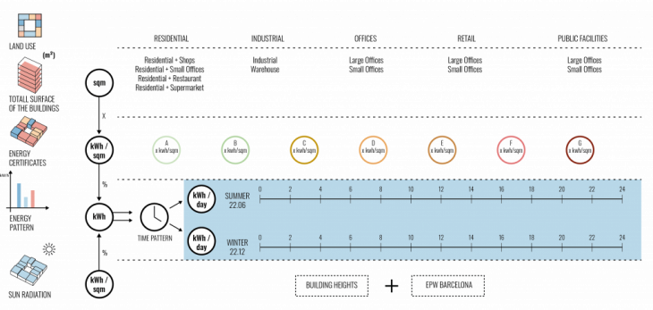
Figure 3. Data structure
Considering the different methods used to generate our dataset, it can be concluded that the dataset is an approximation to real data that is not openly accessible. It has been a good exercise of data gathering, cleaning, and structuring, customizing it having in mind the type of analysis and strategies to propose. A key lesson from this experience has been the importance of having a clear focus on what is the data going to be used for. The entire process of gathering, cleaning, and structuring data requires a certain degree of editing and creativity that has to be clear, in order to generate the proper dataset for the analysis and visualization that have to be produced.
Methods used
The methods used for this project allowed us to use both maps and graphs. Indeed, based on the data structure and the purpose of the project, the methods used have been focused on showing:
- Territoriality (mapping): the consumption and production of energy per building
- Temporality (graphs): the variation of energy consumption and production per hour
- Relationships (diagrams): visualize connections based on energy, time, and space
Territoriality
The availability of data per parcels and floors, and therefore per square meter, gave us the basic data to calculate the consumption and production per building. Energy data can be easily communicated using figures and graphs, although in our case, it was relevant not to lose the link between the consumption and production with the building where this data was generated. The use of maps has been mainly used in this project and along the year, in order to better describe the manifestation of specific phenomena, such as densities, demographic data, or socioeconomic, among others. In our case, it has been used mainly to visualize consumption patterns, potential energy production, energy balance, and building categorization based on the strategies proposed (Figure 4 & 5).
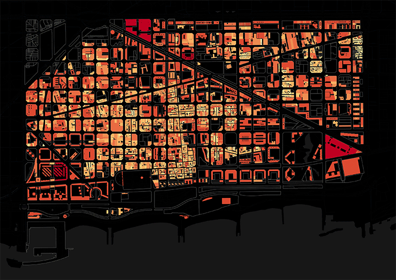
Figure 4. Consumption per hour
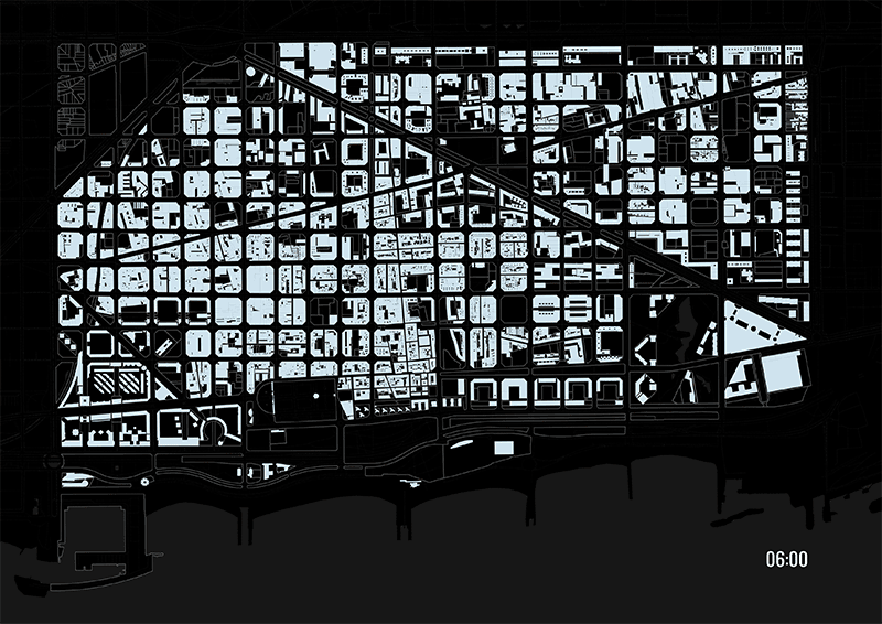
Figure 5. Production per hour
Temporality
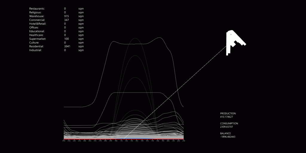
With the purpose of showing how values change over time, we have used diagrams, generally having time as an “x” axis and different variables in the “y” one. During the year, this kind of representation has been used considering different life spans: years, months, days… In our project, we have used hours as a unit of time, since it is the way to understand different consumption patterns. It is interesting that the seasonality data, also related to time, is being shown through maps more than graphs: indeed, winter and summer are just two time frames, without any purpose of analyzing a pattern, just two different scenarios to be compared. It is interesting therefore seeing how the variation of data through time communicates certain information, while the comparison of frames says another one (Figure 6).
Figure 6. Consumption patterns per land use
Relationships
This last method has been used throughout the year mainly to show the existing causality between different phenomena, such as traffic and pollution, income and housing affordability, mobility, and inequality, among others. In our case, we are comparing the production capacity and the production capacity of each building, classifying them according to their position: high consumers, consumers, producers, high producers (Figure 7). This entire process allowed us to better understand the possibilities of energy exchange in our area of study, avoiding the territoriality of the buildings and using a more abstract way to interpret the reality. If the focus of the research is clear, these relationships are easier to be built, otherwise, there is the risk of creating diagrams that are not adding anything and just confuse the audience/readers.
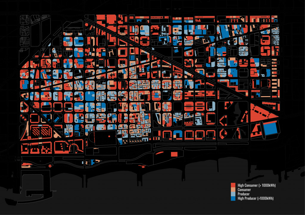
Figure 7. Categorization of building based on the consumption/production energy balance
Let’s visualize data and communicate
As important as the quality of data and the methods to work with it, visualization is key in order to communicate. Proper analysis and proposal require a visual message that helps the audience to go through all the processes. We did some experiments with the aim of getting the visualizations more direct and easy to understand.
The Sankey diagram has been used to better represent a flow of energy. It shows from left the time of the day, in the middle column the proportion of land uses on Poblenou and on the right one the percentage of that consumption that is supplied by non-renewable resources and renewables. This Graph helped us to link the different layers of information that we already had, understanding how they relate to each other. It is visible how the consumption is higher at night, how residential, industrial and offices are the main consumers and what percentage of that energy can be obtained from renewable sources (Figure 8).
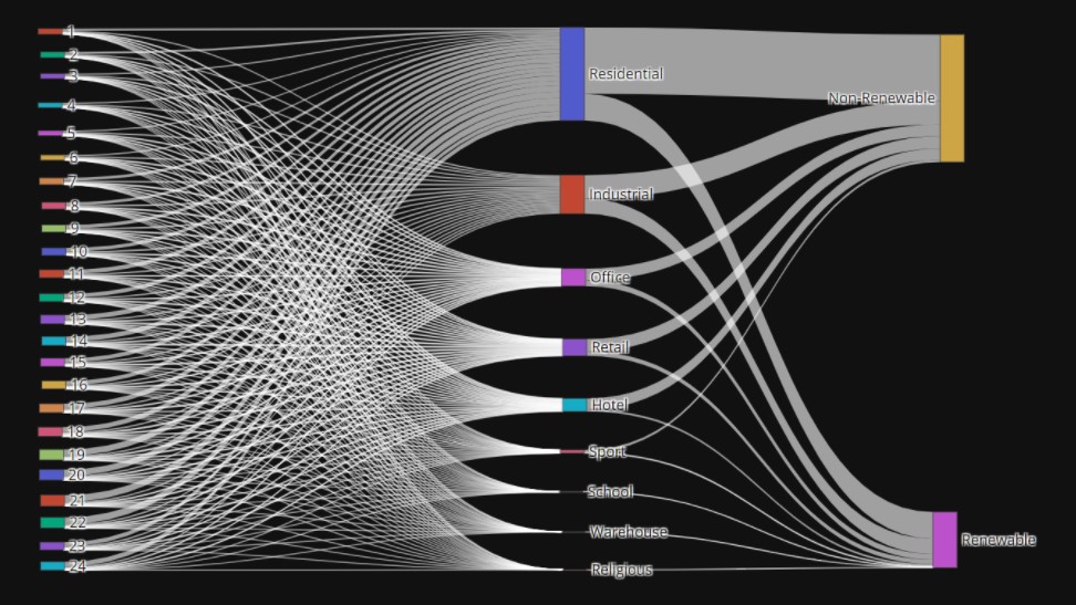
Figure 8. Energy flow
The scatter-plot allowed us to see the relationship between energy and consumption across the buildings, something the Sankey diagram didn’t help us to understand. This other graph helped us to identify the outliers and where they were skewed. The majority of buildings are skewed to the consumption axis, which means they consume more than they produce, and most of them are concentrated near the origin. It represents a good visualization to show how the buildings are categorized based on their consumption and production pattern (Figure 9).
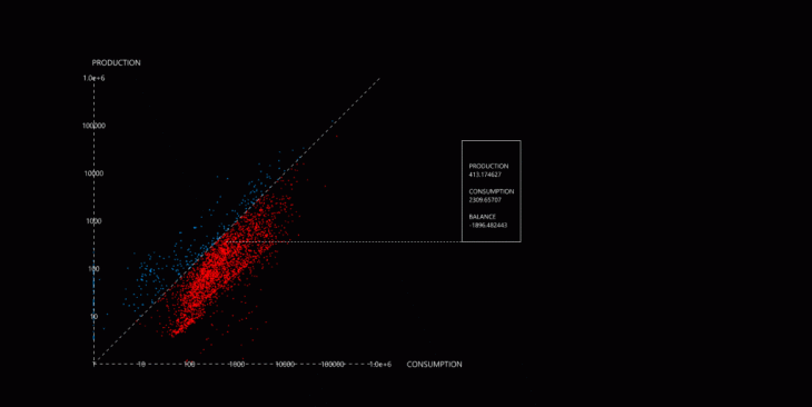
Figure 9. Scatter plot consumption/production
Finally, we used this mix of map and diagram to show the balance between consumption and production to see if there were some buildings that are net producers and identify the potential of energy exchange (Figure 10). This exercise showed us that there wasn’t a clear pattern of energy flows, and we thought the output showed a chaotic flow that characterized each building. In the end, we thought that this type of visualizations can have potential, with the use of adequate filters, and aesthetic editing it could show interesting underlying patterns. We decided to use another kind of representation, based on the existing energy grid.
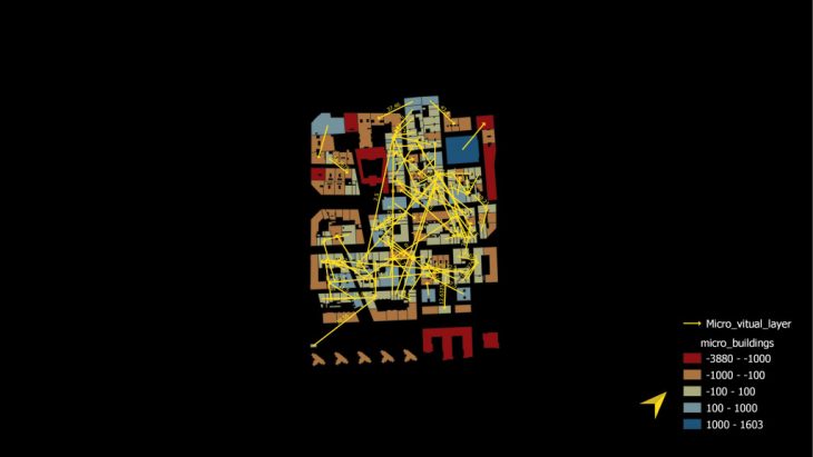
Figure 10. Energy exchange
Final thoughts
All the projects developed along the year represented opportunities to learn and practice new skills. In each of them, individually or in the group, we took decisions that shaped each project, its development, and its deliverables. There is an evolution, but also the awareness that more time is needed in order to master one tool or consolidate one skill. Towards the future, all this knowledge can be used for different career paths in consulting, research, or building our own business. Maybe it will be not possible to keep using all the tools learned, although it is important to not stop completely, eventually slowing down. In fact, like with any learning curve, proficiency is acquired with practice over time.
About (learning & energy) curves is a project of IAAC, Institute for Advanced Architecture of Catalonia developed at Master in City & Technology in 2020/21 by students: Álvaro Cerezo, Marta Galdys, Nadh Ha Naseer, Juan Pablo Pintado, Riccardo Palazzolo Henkes and faculty: Diego Pajarito