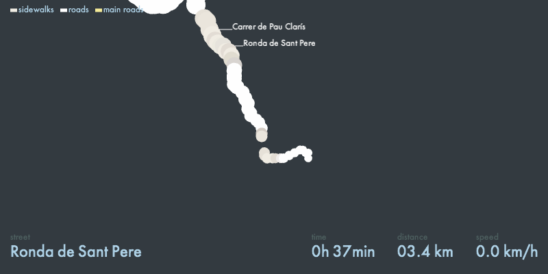
Video of the final version:
A walk in Barcelona. Visualization of GPS data. from Bert Balcaen on Vimeo.
Here are some notes on how I got there. I experimented with adding the street names next to the trail. This puts more emphasis on the sequence of the streets. However, the label positioning (overlaps) seemed like a problem I couldn’t solve quickly. I found a nice solution from Moritz Stefaner that uses forces to make sure labels don’t overlap each other. Looks like a very good starting point for a future project.  In this video I used another data set. The one in the previous videos is me running. Here I’m using a recording of an evening walk through the city. There are some interesting moments: me trying to find a shop (without using GPS) and getting a little bit lost, the rythm of my walk, stopping for traffic lights, etc. Also watch how the GPS gets confused and the data starts to get noisy when I spend some time in a supermarket. I decided not to clean up the data and just leave it like it was. I also changed the panning. Instead of keeping the current location always in the center of the screen, I added some very simple tweening so the map doesn’t center immediately on the last position. I think it conveys the feeling of space a little bit better like that. Then I took another look at how the data was being displayed. I thought it would be good to give the viewer some more information about what kind of walk this was, so I added time and distance. I also included a legend for the colors because I always had to explain what they meant when I was showing the video to someone. I’m pretty satisfied about this project, giving the time constraints we had (just a few days). Here are some suggestions I got from people who saw it:
- Use the compass to show what I was looking at during the walk, and show those places using a POI database.
- Try out other ways of visualizing the trail.